What color is the future?
When I was in the third grade, my small primary school in Sharjah chose Andrew Lloyd Webber’s Joseph and the Amazing Technicolor Dreamcoat as its musical for the year. Over two decades on I can still remember almost every word, particularly the titular song Joseph’s Coat, which lays out the family dynamics—Joseph, the preening favorite son; the brothers, jealous and bumbling—before getting down to the amazing technicolor dreamcoat. The costume in question was a disappointingly muted, stripey housecoat of an affair, but in song it was red and yellow and green and brown and black, and also a whole host of colors that were deliciously unfamiliar to me at the time: scarlet, ochre, peach, ruby, olive, violet, faun, and lilac, gold, chocolate, mauve, cream, crimson, silver, rose, azure, lemon, russet. They were sandwiched between a final return to more basic tones: grey and purple and white and pink and orange, which all crescendoed to an exuberantly accented, almost yelled BLUE.
That final, emphatic blue stuck with me. As if the colors started whirling together like Apple’s rainbow pinwheel to fade not into black or white, but instead to an overwhelming, smothering blue screen of dreams, indigo and sapphire and denim and cobalt and Prussian blue and International Klein blue and #ooooFF, the approximate shade of the Blue Screen of Death. Blue, the color of the future.
For the longest time, I thought the future looked like the 1960s cartoon The Jetsons. Hermetically sealed glassy architecture, sentient robots and flying cars, an Atomic Age palette of silvers and blues and teals and white skin. Despite occasional blips (an acid green space car, George and Jane Jetson’s orange hair), I remember the color scheme as retaining a sense of overall greyness—a wash of that overarching bleakness of postindustrial Europe and North America. I was surprised to find a variety of colors, purples and pinks especially, upon revisiting the show. The Jetsons pairs a cool-toned color palette and aesthetic that has become synonymous with white Western articulations of the future. Afrofuturism deepens this palette, replacing pastels with jewel tones. Yet while chalky cornflower blues and clouds give way to navys sprinkled with stars at night, the predominant color remains blue.
The future, in these imaginaries, is inextricably entwined with the sky: with the flying cars that never quite materialized, with the race to the Moon, with the yearning to travel to Saturn and beyond. Space, as Sun Ra put it, was the place. When we consider other geographies’ futurisms, however, other color stories emerge. Gulf Futurism reflects the Arabian Gulf cities from which it sprung: the dusty blues of sky and sea, the beige or rust of desert sand—depending on whether it’s coastal or inland—the black and white of Khaleeji national dress (and no south and southeast Asians in sight), and an assortment of gleaming metals. Sinofuturism varies a bit more, but reds, golds, neons, and a general brownish haze predominate. If these look a lot like the western imagination of the future via Dune and Blade Runner, that’s no coincidence. It is an extension of the dynamic that asks of the future not that it gets better, but that it gets exotic, that it gets weird.
Cyberpunk was notoriously appropriative of course—what Wendy Hui Kyong Chun calls “high-tech orientalism”—and might be understood as an aesthetic response to Western fears of Japanese dominance. Here, the future is recast as an abstracted East Asian city for American console cowboys to jack into and conquer. Decades later, vaporwave would bricolage together kanji (and sometimes Arabic script too), Renaissance sculptures, and 1990s operating systems, casting them in a more constrained palette of pink and purple. Consider also the aquas and teals of the short-lived seapunk, which seemed to splice the watery vibes of electronic duo Drexciya and the Black Atlantic with even more nostalgia for the 1990s, and so many dolphins.
The funny thing about futurisms is the way they’re often predicated on a return, often for or to a time of civilizational greatness: Ancient Egypt in Afrofuturism, or the Indus Valley civilization in Desifuturism, or pre-contact America—settlers are delightfully cast as invading aliens—in indigenous futurisms. When the population doing the projecting is not marginalized but enfranchised in the present, as with the American space age or the Arabian Gulf and China today, the attendant futurisms take on a rather more ominous near-future timbre. But whereas older futurist imaginaries tended to be more varicolored, over time, there’s a move towards simpler colorways. Purple and white and pink and orange all give way to blue.
At some point chromakey backgrounds became a synecdoche for futurity. This is due in part to the fact that image sensors, in an attempt to mimic the human eye, are especially sensitive to the color green. Greens connote virtuality and technological savviness in the present, the color equivalent of a figure reaching out to grasp empty air while wearing a VR headset. Think the acid h4ck3r gr33n on black of older command line interfaces or the weeping willow of Matrix text. As such, it is especially prevalent in the work of artists like Hito Steyerl or Mark Leckey, who variously deploy it in videos, installations and the occasional greenscreen fluffing. At risk of oversimplifying, we might note that a number of Black artists and people of color, Sondra Perry, Martine Syms, Chitra Ganesh, and American Artist among them, have tended more recently to incorporate blue and purple screens rather than green.
Green is also inextricable from the environment in the broad cultural imaginary. Greenscreens have otherwise become a staple feature of televised weather reports, with no small irony that the rising temperatures reported every day are precisely why we don’t have a future. And—is there a piece of greenscreen art more iconic than Paris Hilton delivering the weather report on Earth Day 2018, saying, “That is Earth. It’s hot. Don’t pollute”? As such, various eco-futurist movements that take climate change into account all incorporate this color, from solarpunk to Bruce Sterling’s early 2000s Viridian Design movement. The latter is particularly interesting in that the very dark teal shade was chosen precisely because it was so unnatural and distant from the leafy shades previously associated with environmentalism.
But while green may be the shade of holistic considerations for the future, blue has come to be inextricable from the future as we more narrowly imagine—and increasingly, experience—it, on, in, and surrounded by screens. Take the screen, as shown in film. Chris Noessel and Nathan Shedroff, who ran the now-defunct design blog Scifinterfaces—which analyzed the interfaces found in sci fi films—have found that the screens depicted in the overwhelming majority of sci-fi movies that were released between 1968 and 2011 are predominantly depicted in shades of blue. Citing their 2012 book Make It So: Interaction Design Lessons From Science Fiction, 99% Invisible’s Roman Mars attributes this to Noessel’s assertion that as a color that’s rare in nature, blue takes on a quality that immediately connotes the alien, unnatural, and otherworldly. There’s an extended history of blue skin being used to signify otherness too, from the woad used as body paint by the Iron Age Pict tribes of Scotland through to the Na’vi of James Cameron’s 2009 white savior frolic Avatar. In India’s gargantuan Amar Chitra Katha series of mythological and epic comic books, it is variously used to signify divinity and the infinity of nature—such as pale indigo for a god who swallowed poison to save the universe—or found in darker hues to depict dark skin, in a manner analogous to Curtis Mayfield’s people who are darker than blue.
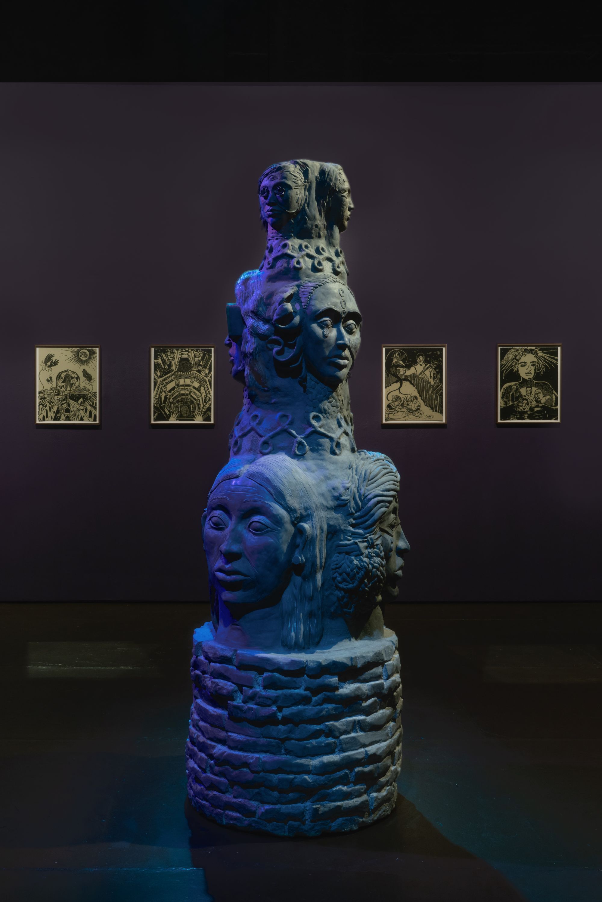
Installation view of Chitra Ganesh, "Her garden, a mirror," The Kitchen, New York, September 14 - October 20, 2018.
Photo: Jason Mandella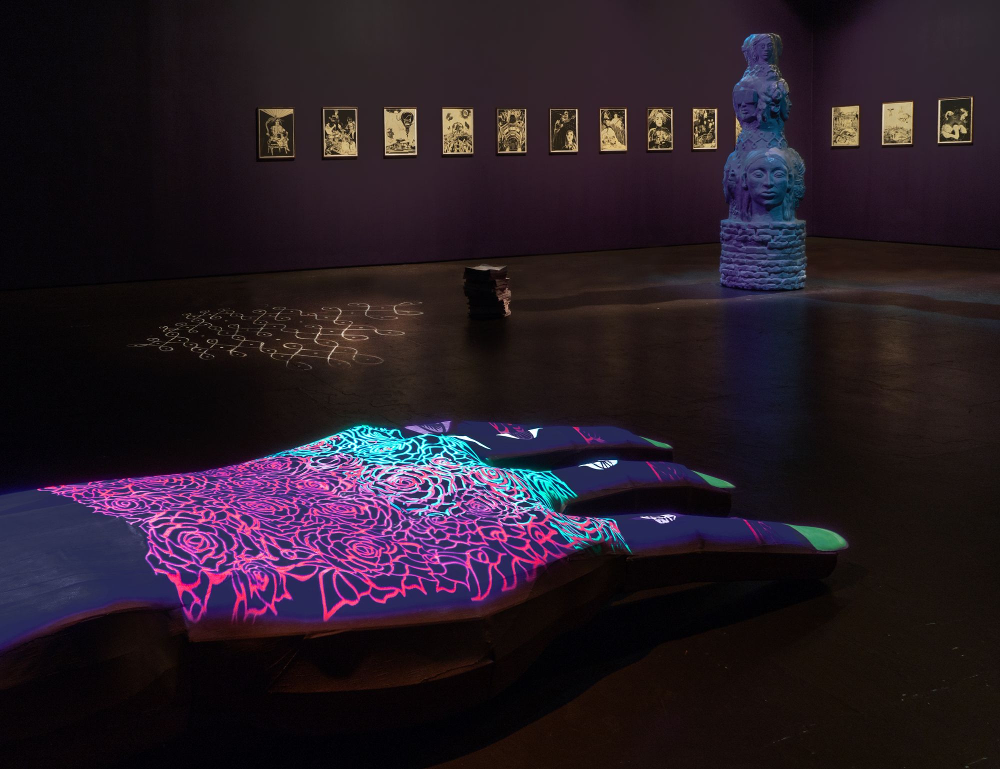
Installation view of Chitra Ganesh, "Her garden, a mirror," The Kitchen, New York, September 14 - October 20, 2018.
Photo: Jason Mandella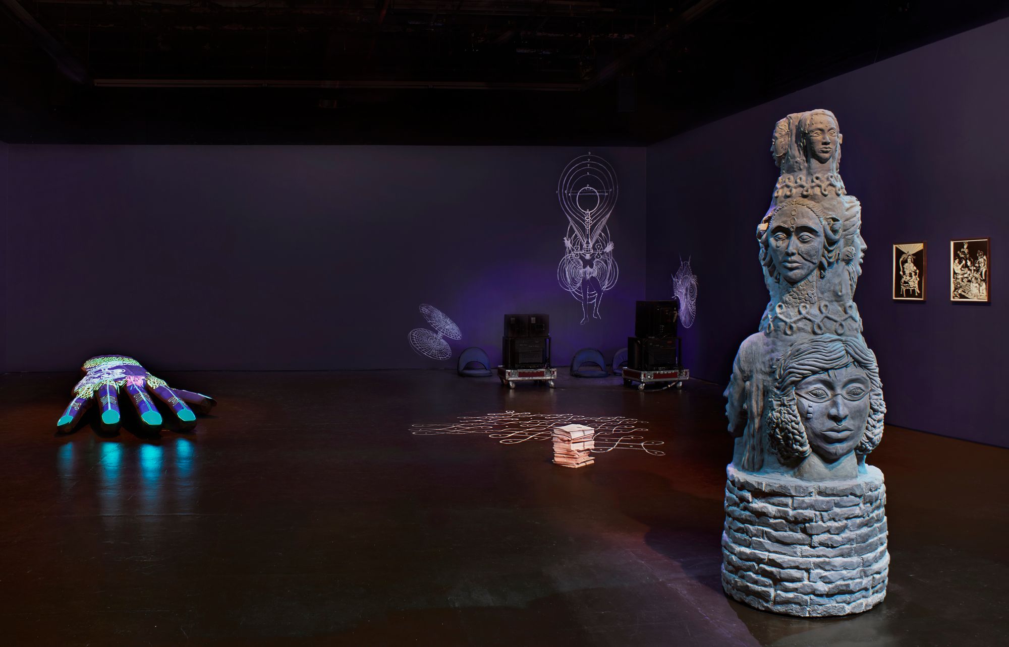
Installation view of Chitra Ganesh, "Her garden, a mirror," The Kitchen, New York, September 14 - October 20, 2018.
Photo: Phoebe d'Heurle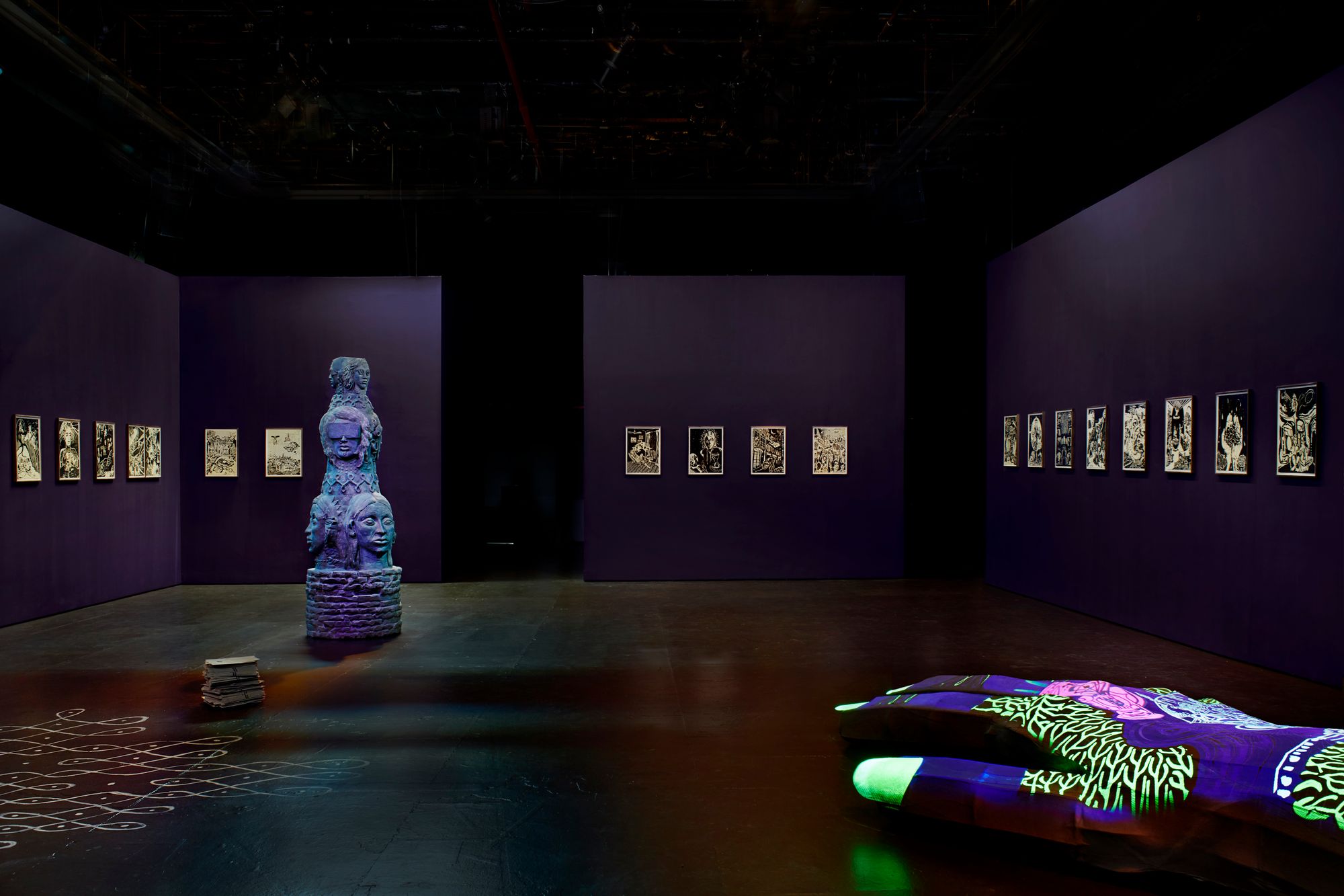
Installation view of Chitra Ganesh, "Her garden, a mirror," The Kitchen, New York, September 14 - October 20, 2018.
Photo: Phoebe d'HeurleIn his Triple Canopy essay “Thirty Six Shades of Prussian Blue,” Joshua Cohen traces the development of blue pigments in art, from ultramarine—a pigment so precious that it was at one time more expensive than gold—and indigo—a dye which boasts a particularly bloody colonial history—through to Prussian blue, a painter’s first stabilized, reliable blue and arguably the first artificial or synthesized color. We learn, too, that in 1958, “Prussian Blue” would become the first Crayola color to be renamed “Midnight Blue,” a change prompted by American students’ unfamiliarity with Prussian history. Much later, in 2003, a set of preteen twins would take it up as the name of their white nationalist pop act, so named because of their Prussian—that is to say, Aryan—heritage and, chillingly, the supposed absence of Zyklon B coloring in concentration camp gas chambers as an evidential refutation of the “Holocaust myth.”
Here, too, is a sense of blue’s inhuman nature, neatly encapsulated in several of the cited fragments that make up the bulk of Cohen’s piece. Take this, from Vincent Van Gogh from a letter to his brother:
“One should not work Prussian blue into one’s drawing of a face; for then it ceases to be flesh and becomes wood.”
Or this, from John F. Carlson, from his book Elementary Principles of Landscape Painting (1933):
“I find Prussian blue is the only blue that retains its exact color-cast under artificial light, and since a picture is so often seen in such light, I deem this worthy of consideration.”
In subsequent chromatic updates, intensity of hue became a motivating factor, most notably in monochrome painter Yves Klein’s eponymous International Klein Blue, which he would describe, in the text for a 1957 solo in Milan as “a Blue in itself, disengaged from all functional justification.” A brilliant ultramarine, it derives its shocking intensity not from the shade but the proprietary synthetic resin in which the particles are suspended. We might also look to vantablack, the “blackest black” and various new pigments crowned the “whitest white” for other examples of color collapsing into materiality. In William Gibson’s Zero History (2010), Hubertus Bigend memorably wears a suit of IKB blue, so chosen because its intensity unsettles people (the color is notoriously difficult to reproduce on a computer screen), a pigment that technology has yet to catch up to:
"That’s Klein Blue, isn’t it?”
“Of course.”
“It looks radioactive. In a suit.”
“It unsettles people,” he said.
“I hope you didn’t wear it for me.”
“Not at all.” He smiled. “I wore it because I enjoy it.”
I first started writing this essay six years ago; I’ve struggled to finish it ever since. As I’ve watched the UAE—where I grew up and have just moved back to—double down on its state-sponsored futurism, and seen how desifuturisms get inextricably entwined with jingoistic Hindu nationalism, I’ve become increasingly suspicious of this kind of aestheticization. I find myself worrying less about what the future looks like, and more about what it does—and for whom. The thing about futurism is that even when it reaches for liberation, it’s an inherently fascistic enterprise. The color blue, at least in the United States, is difficult to disentangle from the thin blue line of American state-sponsored violence. I think of these lines from Derek Jarman’s elegiac last film Blue (1993), which pairs a static IKB monochrome with spoken voiceovers and a composed soundtrack: “Blue protects white from innocence/Blue drags black with it.” The colors swirl around each other into the future like Odile’s 32 endless fouettés at the end of Swan Lake.
Subscribe to Broadcast