Color of the Pandemic
Pantone just announced their Color of the Year 2023. It’s Viva Magenta! Going forward, you can expect to be bombarded with this “unusual shade” in all manner of ads and products, until you inevitably find yourself draped in it.
We enjoy this annual tradition as much as anyone, but also find it a bit corporate and hegemonic. Market predictions are conservative by nature. Much more interesting to look back and delve into people’s messy personal relationship with color. To that end, we asked a select group of our favorite artists, writers, and thinkers to tell us what colors have mattered to them over the past few years. What shades and hues do they associate with this strange era? What was their color of the pandemic?
We weren’t looking for a survey of the obvious colors associated with this torrid time, like, say, the red and white of ambulances. Instead, we asked each contributor to write about a color that has occupied a special place in their minds, whether it was a hue that suddenly seemed to have political or cultural associations, an object they stared at during lockdown, or just a memory from the past few years that was shaded in a particular way.
This is the spin-off you've been waiting for.
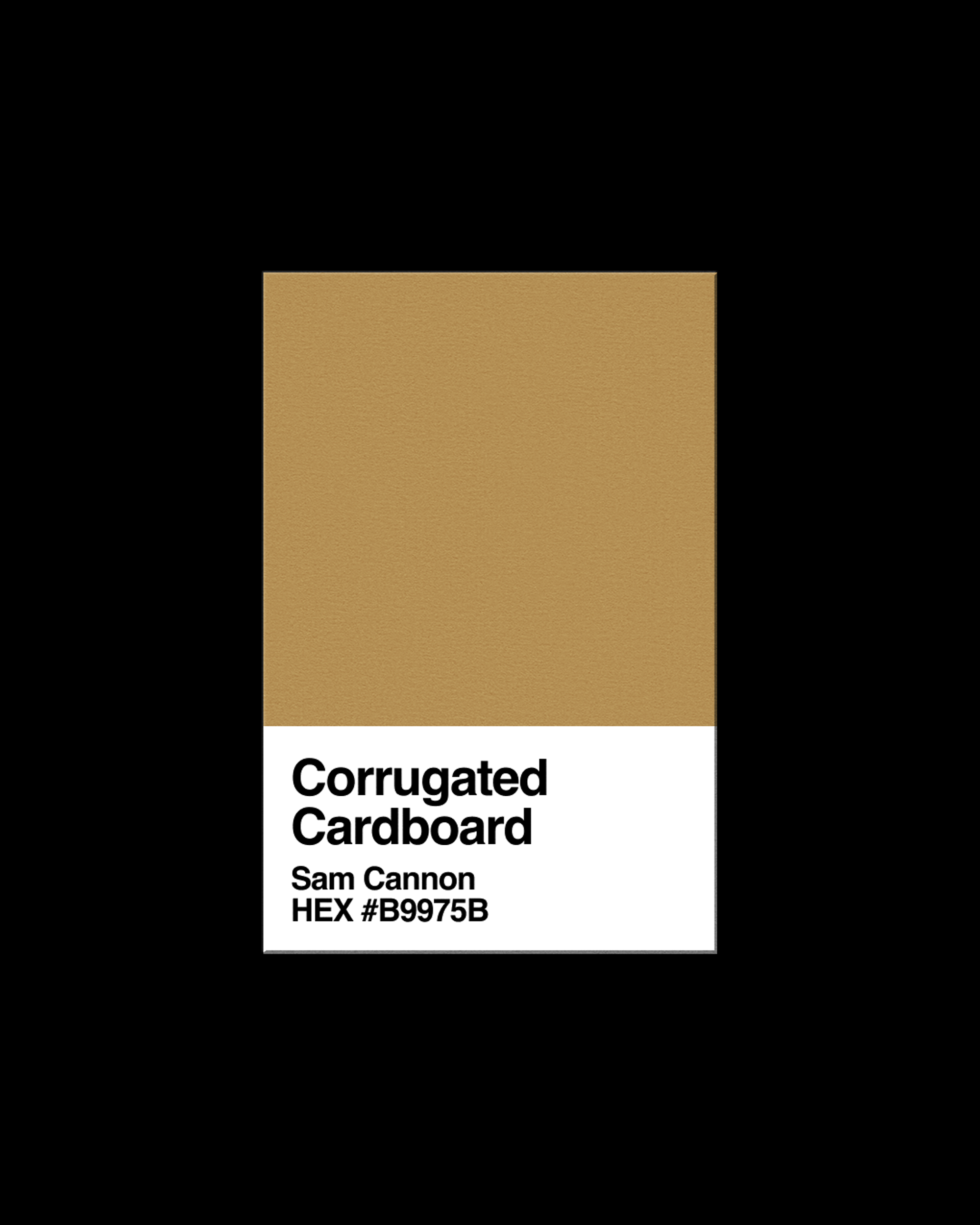
Sam Cannon - Corrugated Cardboard - HEX: #B9975B
Corrugated cardboard brown fills me with dread—a surprising amount of emotion for such a pervasive color.
The internet informs me that cardboard is actually a mixture of brown and orange. That seems fitting: the brown signals the material’s organic origins—the orange warns of impending doom.
Infinite stacks of boxes fill the corridors of my mind—a maze for my wandering anxieties.
Some lay crushed, stacked, bound, assuring me that they are doing their part to fight global warming. (They swear!)
Some contain online orders that didn’t deliver what they promised.
All are evidence of our inability to abstain from a totally unsustainable way of life.
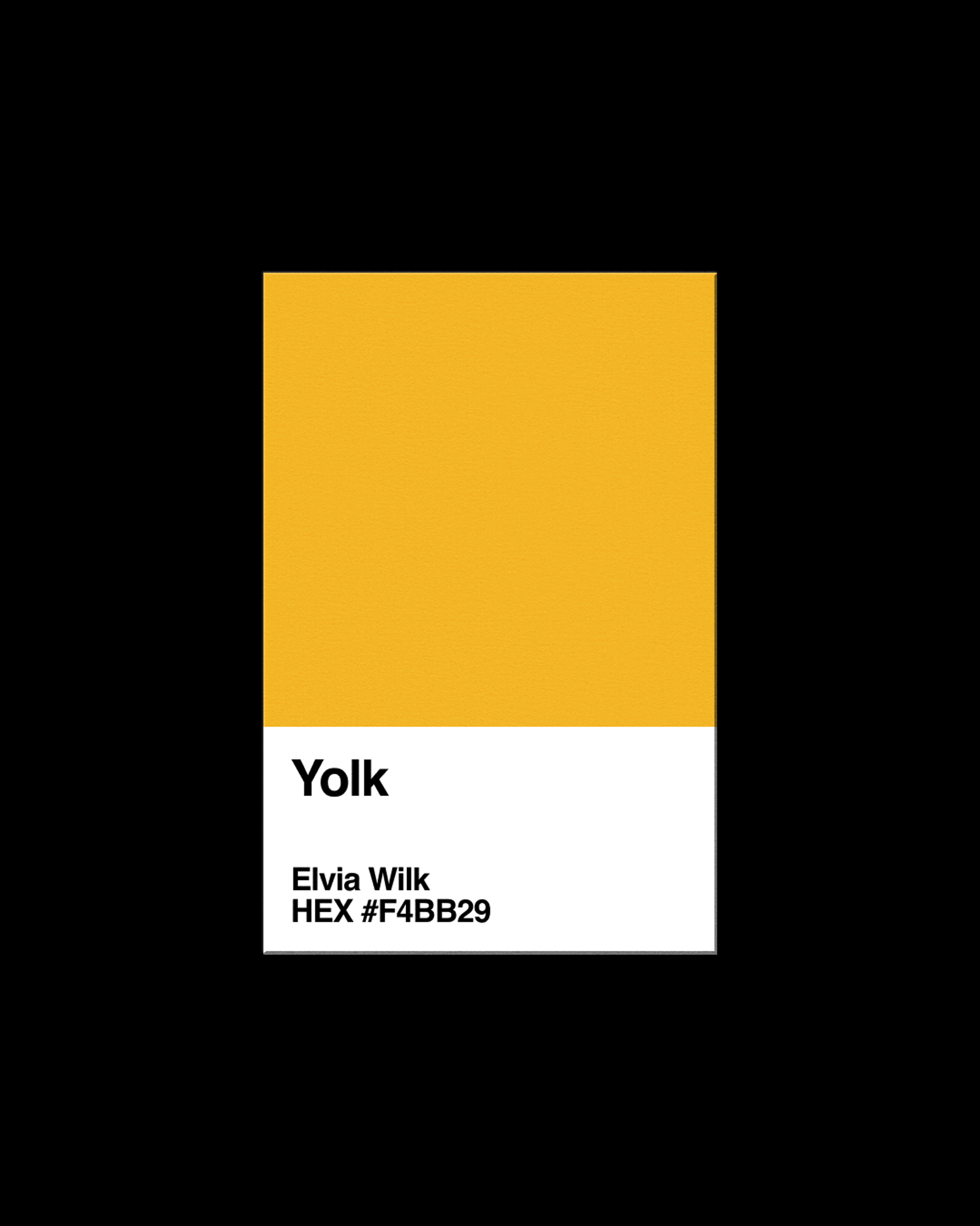
Elvia Wilk - Yolk - HEX: #F4BB29
You could not find a more delightful, rapturous, aesthetically perfect object than the egg. Whole: a symbol of fecundity, rebirth, cyclic time. Cracked: a wet, natal life-form. Two perfect tones: the vacuity of the white and the deep density of the yellow. Yolk is pure potential. Yolk is infinite variation, anywhere from chalky-hard to slimy-wet.
During quarantine, yolk became my love language: my partner and I made every variation of every egg dish from the pages of Jacques Pepin to the hashtags of Instagram. Fluffy cloud eggs, folded tamagoyaki, yellow tiramisu. At some point after months of isolated cohabitation, the loving egg dishes came to signal something a little more dangerous—something that could become codependence. If I came to rely on these devoted egg rituals, what would I do if I ended up alone again? Could I fend for myself?
I documented every egg dish we made on my phone with maximum flash for maximum effect. I wanted to express the feeling that a deep raw yolk gives me: intense satisfaction on the edge of disgust. What could be more intimate and pornographic than the moment the tine of the fork pokes the meniscus of the yolk and the yellow surges outward onto the plate, the toast, the fingers? It’s the lewdest thing you can get past Instagram’s algorithm. Looking back at this library of yolk-moments now, I see instances of devotion and communion punctuating a year—years—of confusion, grief, and ambivalence.
I believe in photographing your food with flash and at maximum saturation, just so you remember that totally saturated experiences are possible, and momentary.
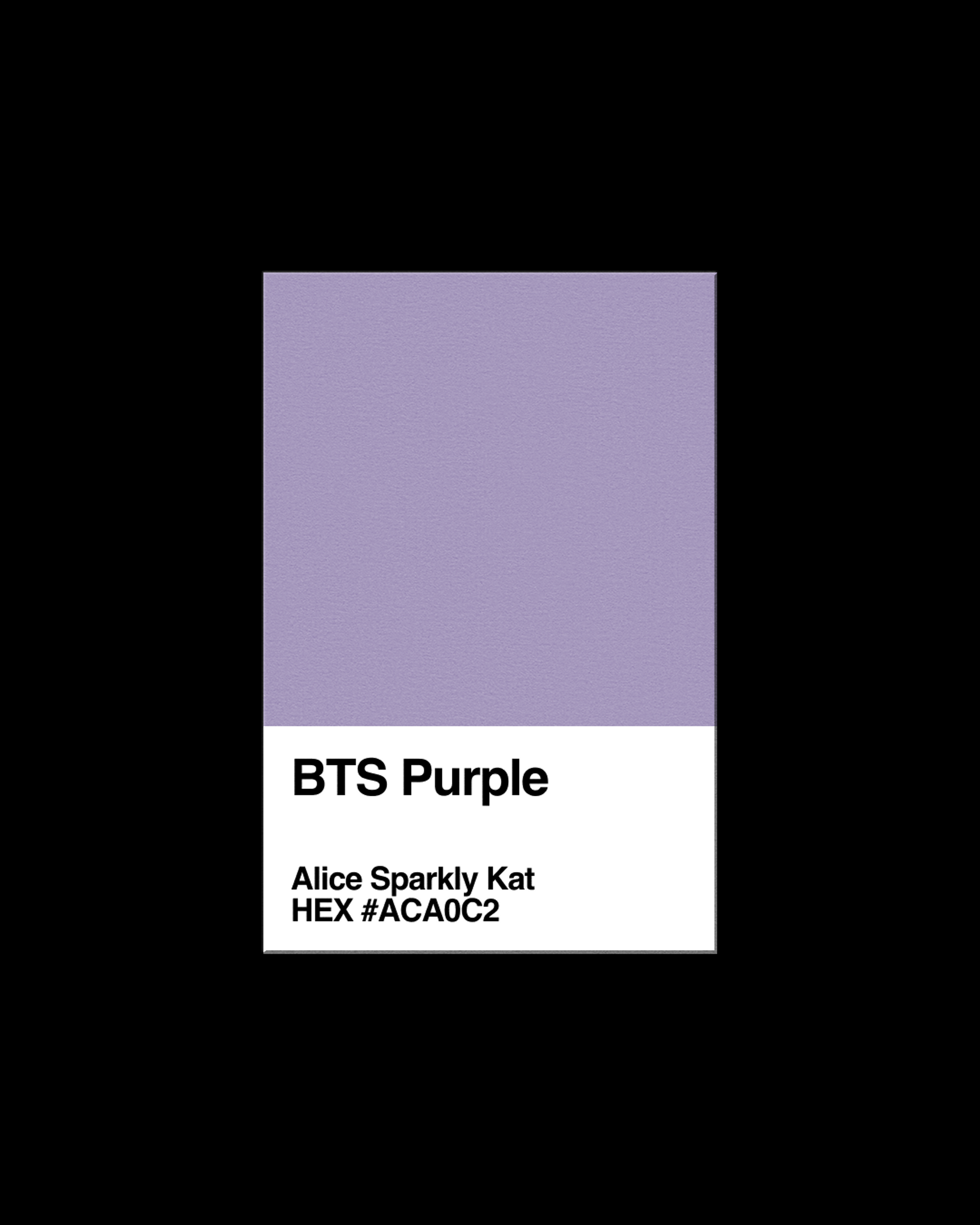
Alice Sparkly Kat - BTS Purple - HEX: #ACA0C2
In 2020, a pandemic hit the world and I, along with millions of other people, became obsessed with BTS. On the group chat I started, the Korean boyband became a manageable way to think about the world—a collective universe where we could recreate everything in the realm of fan fiction. We imagined headcanons (scenarios within a fandom) and ships (relationships between BTS members).
A devout BTS fan is regarded as a member of the “ARMY.” ARMY expresses their love for BTS through purple. ARMY’s purples are flexible. We choose bright purple when we celebrate new releases. We choose lavender when we make hoodies with our favorite member on the front to hug our bodies with. Within ARMY there is also Bitter Purple—an indigestible purple that knows the way grief wrecks the gut. Bitter Purple is a worn, eroded purple, there for you when you feel numb. While ARMY’s celebratory purple is royal, Bitter Purple is distant. It’s not warm. It’s suffocating and almost acidic. It’s a color that is found in nature only during the fall when most berries are poisonous and the milkweed stalks stiffen. Bitter Purple is a purple that knows death.
Youth culture is not always bright. Youth culture is often the shade of Bitter Purple. It is a purple that is, like youth, not easily forgotten. We will never forget the last few years and we won’t forget each other. In a way, Bitter Purple keeps us young forever.
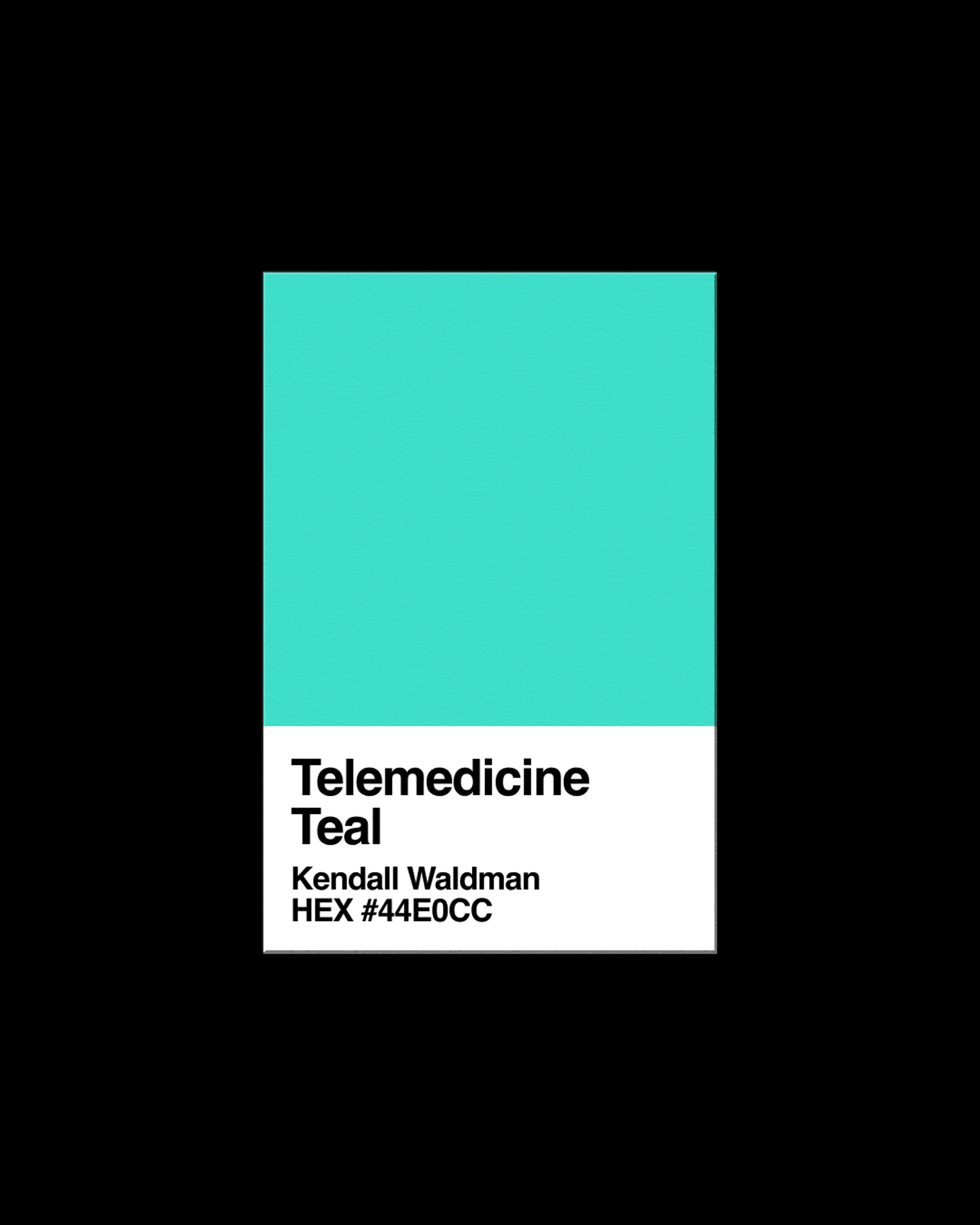
Kendall Waldman - Telemedicine Teal - HEX: #44E0CC
Telemedicine Teal reminds you to get your flu shot. It tells you not to worry and you’re inclined to believe it. You remember it from the candy shell of school binders, the soccer jerseys a local pizzeria sponsored. We pay for this hypnosis: healthcare that blends the cyan of a Twitter check and the pine of money. Be calm, it says. You know this system: it's natural.
At your next doctor's appointment, this deep Aegean turquoise will be Easter-egged throughout. It may pop up in the sheaths of a sample month of birth control, the glint of a screen, the groundwater of oily puddle-rainbows. Like the oasis of a Windows 96 startup screen, it's the color of lullabies for trailblazers. The "I'm not a robot" dropshadow. In some part of your soul, you might remember seeing it ornament the Eurasian duck. Its jaunty feathered earpiece is where the word "teal" first came from, a graceful bird skimming the surface of worlds; blue of the sky and green of the ground, perched on the edge, like us, saying: if you lived here, you’d be home already.
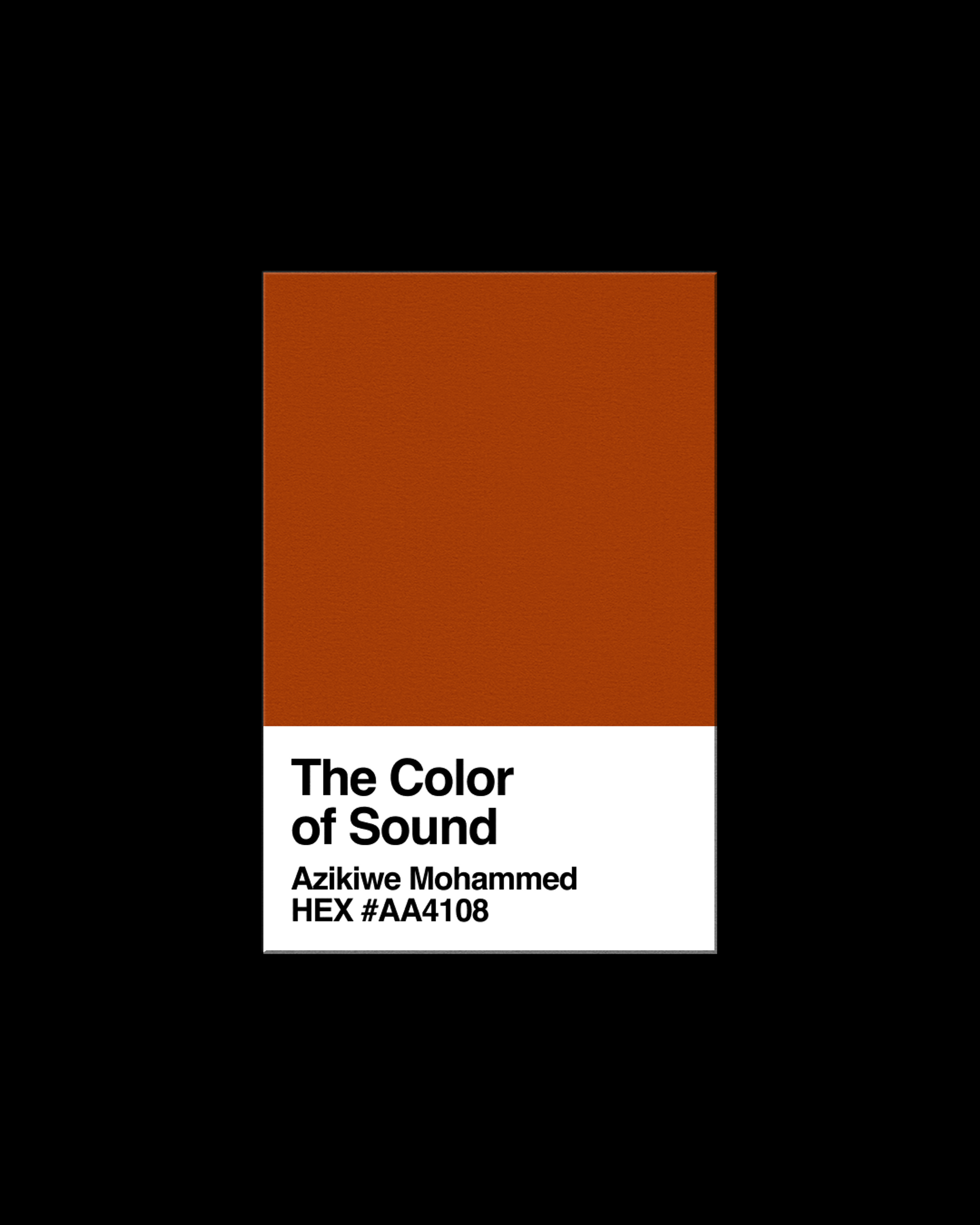
Azikiwe Mohammed - The Color of Sound - HEX: #AA4108
During the early portions of mask world I found myself in a car more than I had anticipated. Car access has never been something New Yorkers are known for and with less people in town (the call of Upstate rang loud for many with access / means) there was far less than normal. This found me driving upwards of 6 hours a day. I had recently started losing my hearing; the only sounds I could still hear easily were helicopters, the constant whirring of which attached me to a type of Blackness I had previously thought out of my reach. Many of the neighborhoods across America are colored by that specific decibel range / frequency but such has never come home to rest in my native Lower Manhattan, for me, until now. At the end of the days driving I went looking for something in a similar sonic range to replace this with a hopefully less violent sonic kinship. I went to the beach. I have never been much of a beach person but found that the sound of waves canceled out my own hearing issues and replaced the helicopters with a sound that reaches as wide if not wider. The longer you stay at the beach the further out the water comes from. A hello from a distant neighbor with patience becomes much less distant. The time I was at the beach was always during Black People Freedom Hours (the hours surrounding dusk) and the sounds that I lived with were the colors of such. Purples, blues, oranges, consequently the colors that Black people look best in. I dyed my clothes to match what I was hearing. I dyed them to match the only thing I could now hear clearly. With me now able to wear the sounds only some of us were listening for maybe more of us could be heard in a way we were not at present. I took many photographs during this time and put them into a pixel collider. This is the color of my hearing.
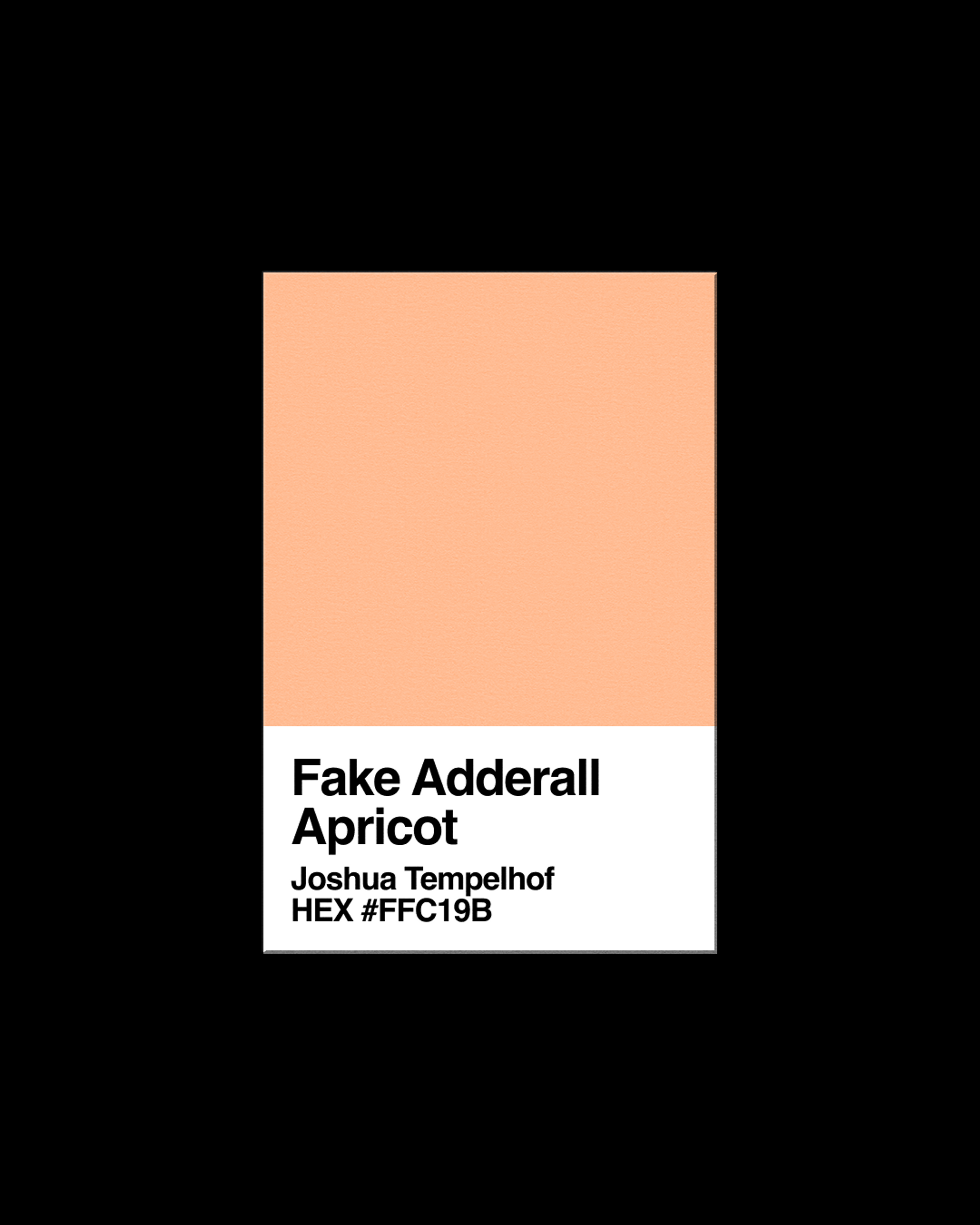
Joshua Tempelhof - Fake Adderall Apricot - HEX: #FFC19B
During lockdown, I had too much time to think about myself—my identity, my malfunctions, and all the work I would have to do to correct them. In the end, I just decided to go back on Adderall. This time, however, I would not get a prescription; that would be too much Adderall, which is pretty addictive, and would take far too long. Instead, I started buying it off a rando from Craigslist.
Pete distinguished himself from the other candidates by his willingness to share his Instagram profile. He sent me a picture of the pills on Signal: gigantic round faded orange basketballs with a 30 on them. The .JPG was geotagged and had just been taken; Pete was legit. In fact, he turned out to be a total sweetheart, showing up cheerfully on short notice every payday, often throwing in three or four extra when I bought in bulk.
And so the next two years skidded by. I wrote long unhinged work emails and uncharacteristically savage tweets. I went on research binges investigating CIA sponsorship of the Nintendo corporation. I accumulated unwashed dishes and unpaid parking tickets. I hardly slept. I grew my hair out. I only started neglecting Pete when I met my girlfriend, but then it turned out that she loved Adderall too, so I introduced them to each other. Soon her apartment looked like my apartment and we both had tiny burst blood vessels on our noses.
I’m not sure we should be buying street Adderall, she said one day. This prompted a street-Adderall-fueled research binge into the origins of street Adderall. Apparently drug dealers everywhere were responding to the world Adderall shortage by just making their own. These stamped pills were, for the most part, dyed aspirin powder punched with meth or fentanyl. They could be identified by their chalky consistency (not as hard as the real thing), their off taste (not as sweet as the real thing), their dodgy inscriptions, and their faded orange color.
I texted Pete my concerns, and he responded, “bro I don’t think so I hope not.” Eventually, I lied to him that I’d had one of his pills lab-tested by a friend and that they contained meth. For the first time in our collaboration, he didn’t respond to me. A few days later, after a barrage of phone calls, a text trundled in: “I’m so sorry my dude.” Ever the gentleman, he didn’t explain further and just appended a $100 Apple gift card as a refund for my last purchase. I took this as an opportunity—a buy-out—to finally get off Adderall altogether.
I have Pete to thank for that. Every time I feel the old urge, I dig up his weird apricot pills and consider taking just a little nip. I never do (meth scares me) and I can’t be bothered to buy new ones, and so that increasingly dusty sandwich bag now serves as a reminder that the fast days are over. Sad to say but also, in its own way, reassuring: even the shortcuts don’t work anymore.
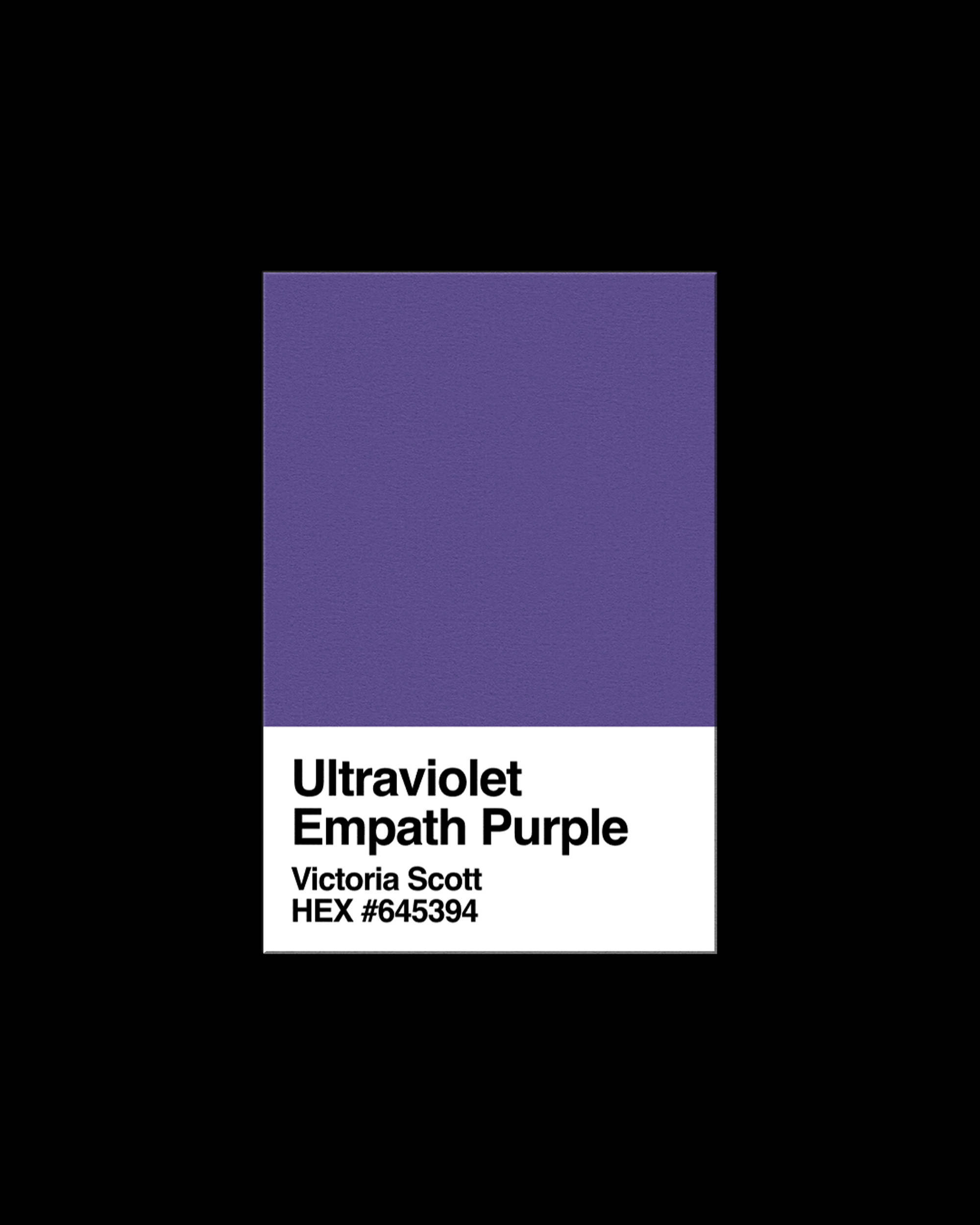
Victoria Scott - Ultraviolet Empath Purple - HEX: #645394
During the pandemic, I noticed the regular online presence of Ultraviolet LEDs—lighting private spaces that had suddenly become digital public spaces.
My nickname for this Ultraviolet light is “Empath Purple.” I imagine it receives *all* the sticky energy and signals—the heaviness and the visions, the body and the aura, the inside and outside, visible and invisible—and then gets a bit bogged down in processing and expressing it all back out.
Ultraviolet LED light creates the container for the simulated intimacy and isolation of a modded PC gaming rig or bedroom TikTok dance-floor—a public broadcast of a transcendent moment—losing yourself dancing in a club.
To me, Ultraviolet LED lighting is a nostalgic reference to late-1980s dance-club decor. In those days, blacklight hid the visible grime and revealed a day-glo spectrum. It was already referential, a knowing nod to the tackiness of blacklight posters from 1970s bedrooms and basement rec rooms—those teenaged suburban incubators for inner journeys and solitary misadventure.
Over the last 20 years, rare blue LEDs have come down in price, allowing everyone to mix a full spectrum of vivid RGB color. UV lights have gradually entered consumer use, but it took a worldwide disaster to activate their true function as a psychic holding space.
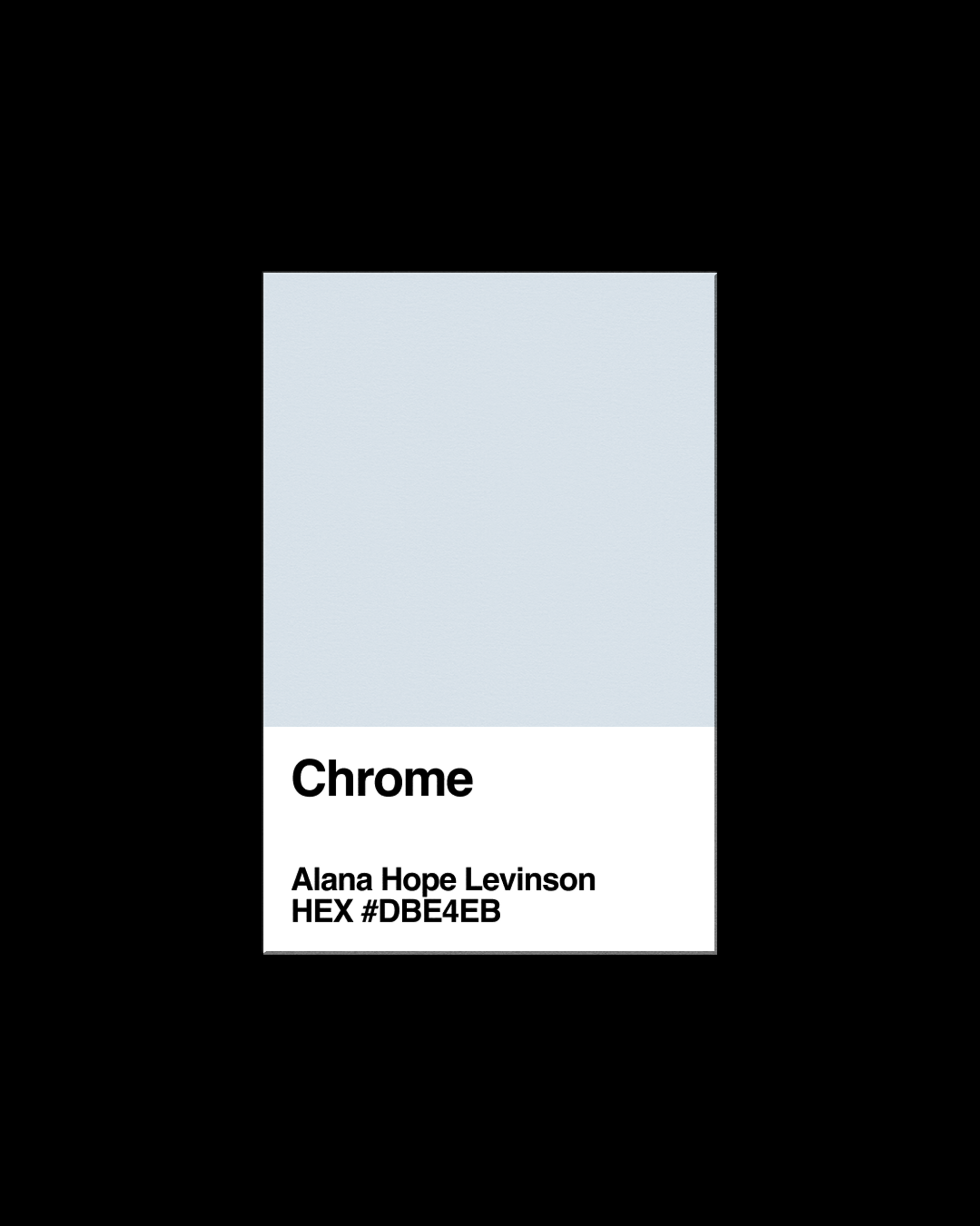
Alana Hope Levinson - Chrome - HEX: #DBE4EB
Haven’t you heard? The world is ending. It’s not enough to be of the future; I need to be from another planet. I tell my manicurist to fashion my nubs into sharpened talons and dust them in metallic chrome—they will be my weapons when the Water Wars start. Does the woman at Sephora get it when I tell her my eyelids need to glow like green biochemical waste? I’m Not Like Other Girls; I need to repel humanoid predators while I sleep. I buy a silver purse from Shein for one cent that doubles as a mirror. I want to make sure I look hot when the aliens are circling Silver Lake. My boyfriend asks me which car we will take if we have to rapidly flee. Silly man. I tell him there are no charging stations in hell: only aesthetics and nostalgia for a tomorrow that’ll never come.
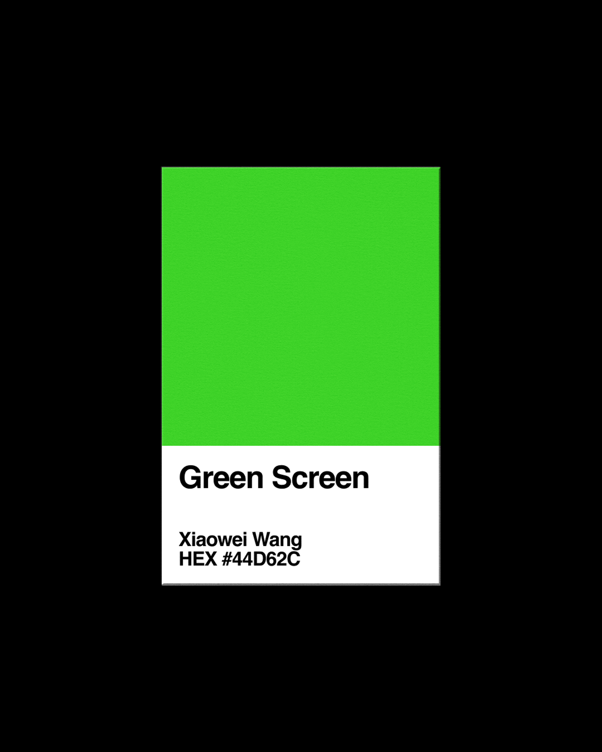
Xiaowei Wang - Chroma Key Green - HEX: #44D62C
Picture these scenes, in quick succession: autumn sunlight cutting through the skyline of a small city. An agricultural field, seen from above by the Landsat 8 satellite. The hushed stillness of a stock image living room. Underwater. These are places I’ve been. The neon fabric sheet I pinned behind my office chair—chroma key green—helps transport me there.
From Latin, the word "medium" denotes something from nature, a middle ground or space. A green screen is like that middle ground, an in-between space. I equate chroma key green with anticipation, a suspension of disbelief that asks you to imagine: this is real.
In the past few years I've lost interest in RGB-illuminated, virtual reality spaces and have become enamored with the different greens in front of me. Tangible greens, like the shocking tendrils that appear from seedlings that have slowly grown for weeks in my garden. I learn from these bright green saplings, as they burst out and fade. I fixate on the green to avoid the reality of decay. Every night for the past two years I've practiced contemplating my own death. I imagine the moon transiting the sun, cloud plumes in a green sky, the swathes of green from Zoom’s “Earth Planet View” background evaporating. I count distance, the shape and arc of longing. Tell me, what medium breaks apart this sorrow? What sits beyond this chroma key green?
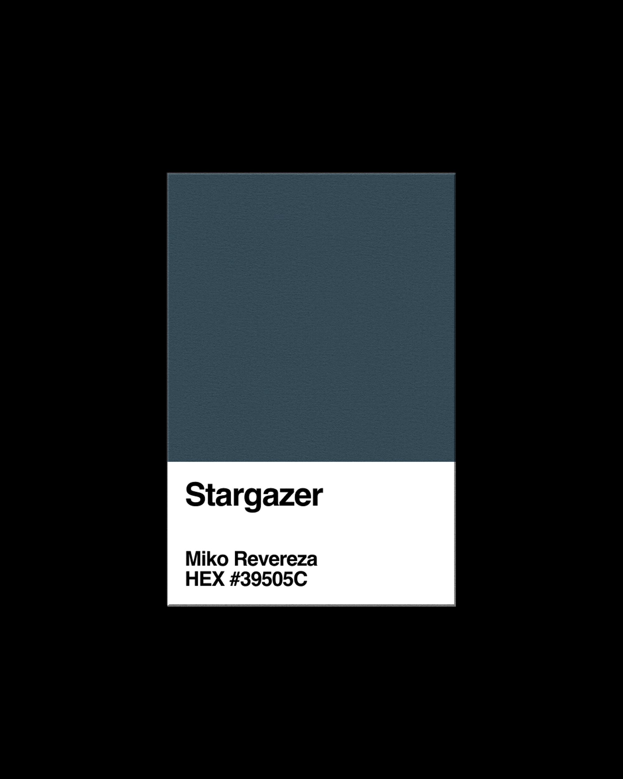
Miko Revereza - Stargazer - HEX: #39505C
Since I left Los Angeles, I’ve struggled to remember the exact tone of the LA River. I have footage of it, shot from different times of the day. The footage does not capture the river’s hues, just the drab, low-contrast images that digital cameras produce when shooting on log setting. I captured these images knowing I was leaving the U.S. for an indefinite amount of time, and wanting to keep the LA River near me, after living only a few blocks away for several years. This footage requires color correction. I rely on memory to recreate the color I perceived standing beside it. A dull forest green washed out by underlying concrete, carrying the residue of algae and duck shit. I searched the Pantone database. 17-4123 TCX Niagara, 18-4718 TCX Hydro, 19-5413 TCX Jasper. Nope, none of these, though 17-4028 TCX Riverside could be referencing Riverside, the street next to the LA River. If so, Pantone is being quite generous. Recently, David Chun participated in a clean-up of the river on a sunny day and messaged me a video of the water surface. It looked pearly, nothing like how I remembered. The LA River may not exist in Pantone’s database, or perhaps the hex code can oscillate. The true color exists in an unstable location, between memories. ♦
Subscribe to Broadcast