Heat Maps in Time
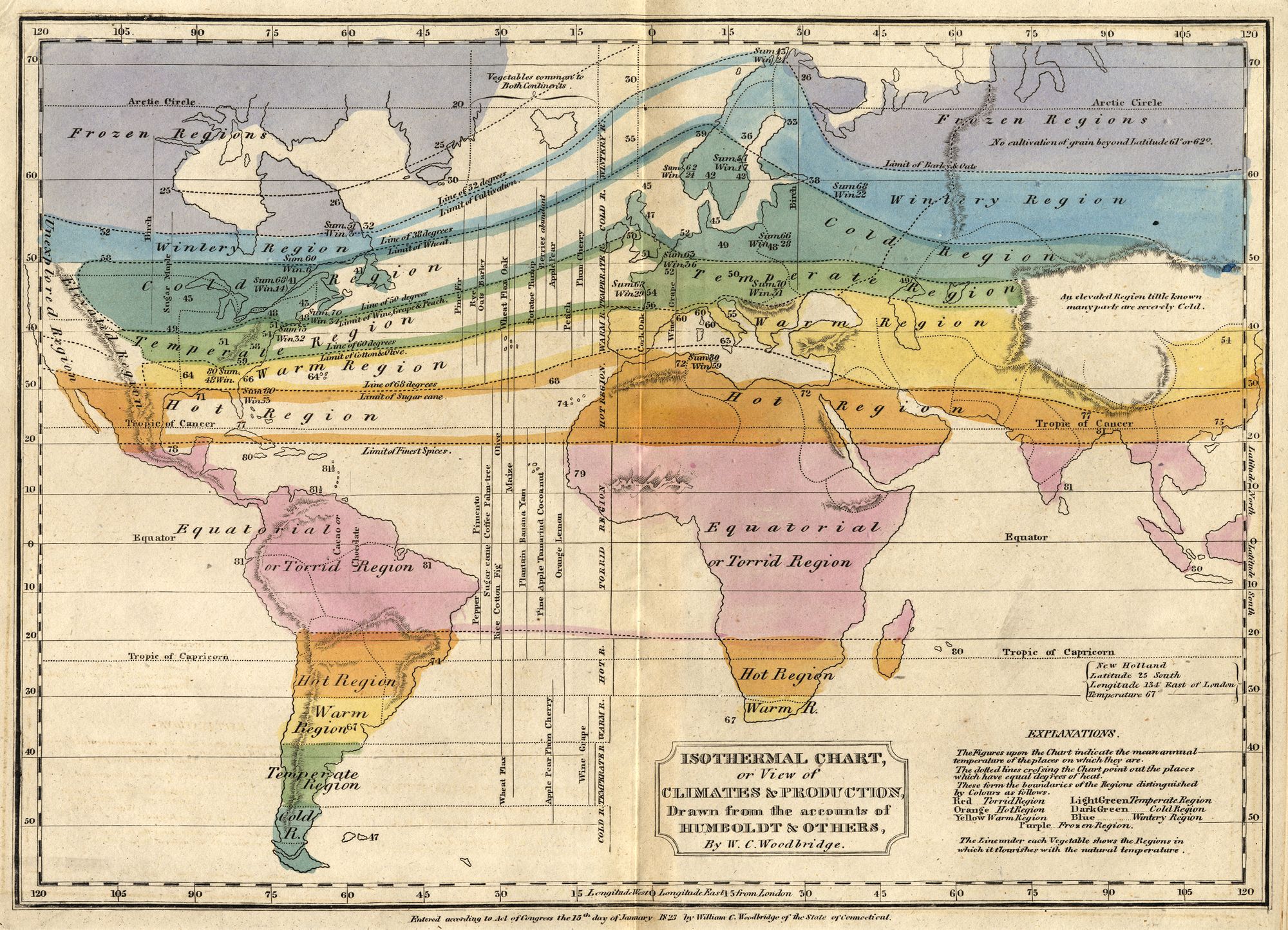
W.C. Woodbridge, “Isothermal Chart, or View of Climates & Production, Drawn from the Accounts of Humboldt & Others,” 1823.
How do you map climate change? As a species given to trying to visualize complex processes and our round planet in two-dimensional charts, maps have been key to bridging the gap between knowing and comprehending. That’s true of all large-scale phenomena. But it’s proven especially so in the context of a crisis whose cascading effects we wake to each day, whether in the form of haze from wildfires or heatwaves out our windows, or news stories about monstrous hurricanes or sea slugs called blue dragons menacing beaches.
For the concerned human wanting to synthesize the varied aspects of a planetary crisis, and to envisage its future effects, the internet is awash in maps that chart the average date of spring’s last freeze; of the lengthening and shifting growing seasons that result; of the fast-changing likelihood, depending on where you live, of snow on Christmas and rain on the Fourth of July.
When Rebecca Solnit and I created an atlas of New York City predicated on the truth that there are at least as many ways to map a place as it has people, we enlisted the climate scholar Daniel Aldana-Cohen to help create a map of climate change in the city. Like all the maps in Nonstop Metropolis, this one aimed to deepen our sense of cities like New York as places of radical coexistence. The background layer of “Carboniferous” charted per-capita carbon footprint by zip code. It revealed how that city’s wealthiest precincts are most destructive of our climate—and was overlaid with two other distinct geographies: locations of entities driving petrocapitalism (fossil fuel companies, banks), and of organizations resisting its effects (community and activist groups, the route of the Climate March in 2014). Gotham emerged as both a key driver of the climate emergency and a vital locus for imagining other futures.
But in the larger visual lexicon of the crisis, as considered not on a municipal scale but a global one, one kind of map above all—maps of heat—have become a hallmark of our age. The visual language this kind of map employs, aptly enough and like the Anthropocene itself, dates from the dawn of the industrial era when sapiens began spewing unrelenting amounts of heat-trapping carbon into our skies. For it was in the early 1800s that scientists like Alexander von Humboldt—the great Prussian naturalist who conceived of all our planet’s ecologies and species as being profoundly interrelated with its climate—also devised maps whose mode of charting temperature remains with us today.
You know the kind of map I’m talking about: take the one, for example, that sits atop Wikipedia’s page for “climate change”—an ovoid projection of Earth’s continents and seas, bathed in oranges and reds, with colors and lines corresponding to data from NASA. This image depicts the change in average surface temperature over the past 50 years (upwards of four degrees Fahrenheit in the Arctic and Europe, less toward the South Pole). Heat maps like this—static images indexing change—have become signal artifacts of our new cartographic age in which the ever-growing power of computers to turn data into images has transformed what was once an analog art and science into a digital one. Today the tag “heat map” is attached to many maps that don’t chart temperature but rather visualize intensity or frequency—whether as tied to where users click on websites, or to the movements of professional soccer players during games.
But the mainstay visual guide to the current crisis are heat maps of a more literal type, whose color code dates from when industrial designers began using a shorthand now lodged in our minds and on bathtub faucets everywhere: warmth is represented by the color of flames and of our cheeks when we’re flushed; cold is the hue of ice and frost-bitten limbs. This chromatic symbology matches what you learned in art class about “warm” and “cool” colors, which perhaps made those lessons easier to retain (at least if you didn’t also learn, in astronomy, that stuff is different in outer space, where blue stars are hot and red ones are cool). It’s a system that also tints countless maps used by citizens and policy-makers to engage the climate emergency’s larger implications—like this one, made by New York City Council to visualize the so-called urban heat island effect, a map of relative temperature across a city whose green parks and leafier precincts, in this rendering, beckon as beacons of cool. Poorer areas register as expanses of treeless concrete, whose lack of green compounds summer temperatures that menace the health of residents who, as other city maps show, also lack access to air-conditioning.
Such correlations across space and time—whether absorbed at the scale of a city or of the planet, and whether correlating economic, cultural, and climatic data or all of the above—are vital for understanding the cascading and complex interdependencies of climatic shifts, which are by no means uniform in their effects. Ours is a planet whose deserts are growing drier and forests wetter but also whereon long-temperate regions like Northern Europe may in fact grow far colder if warm currents in the Atlantic stop coming their way. Which is all a part of why it’s fascinating to look back, as we gaze warily ahead, at the most notable early attempts to map the earth, in scientific terms and as Alexander von Humboldt put it, as “one great living organism where everything was connected.”
It makes all kinds of sense that the person most responsible for making this ancient idea central to science was also a keenly visual thinker who historians of cartography have credited as being “one the first scientists to use maps to generate and test scientific hypotheses.” Today Humboldt’s name is more famous than he is: his moniker adorns ocean currents and counties and mountain ranges around the world, along with over 100 species of animals, including the Humboldt penguin and Humboldt’s woolly monkey. In his own era, the man himself was famous indeed—so famous that the centennial of his birth, a decade after his death, witnessed celebrations around the world in 1869 that included a mass gathering in New York’s Central Park attended by 25,000 people. Like other of Humboldt’s celebrants from Boston to Berlin, they turned out to hail the memory of a scientist who did more than any of his peers to inject into the discourse of science the principle that, as he put it, “all forces of nature are interlaced and interwoven.”
Humboldt’s determination to prove that point saw him embark on years-long expeditions to America’s tropics whose research yielded many books and influential maps like the one he produced in 1802 after climbing Chimborazo, an Andean peak in Ecuador which at the time was thought to be earth’s highest. In that map, which Humboldt made with a French botanist named Aimé Bonpland, a vertical cross-section of the mountain charted how each of the species they encountered, from tropical ferns by its base to windswept lichen and a single butterfly they spotted at its tree-line, correlated to its distinct climate at different elevations. Their map inspired numerous alpine imitators. It’s also proved a remarkably useful document, more recently, for scientists studying how slopeside ecologies in the Andes, over the past 200years, have shifted uphill by 700-900 feet.
W.C. Woodbridge, “Isothermal Chart, or View of Climates & Production, Drawn from the Accounts of Humboldt & Others,” 1823.
But if that Andean map was both an object of beauty and science, it was Humboldt’s charting of climatic variation across the scale of our entire Earth that secured his place in cartographic history. As a recent acclaimed biography describes his legacy, Humboldt may have been the “inventor of nature,” at least as an idea and worthy object of study in the West. But he was also the inventor of isotherms: a cartographic tool whose name you may not know, but which you’ve seen hundreds of times in weather reports on TV. Described by Humboldt as “a curve drawn through the points on the globe which receive an equal quantity of heat,” he devised his isotherms to show that climatic zones don’t hue to rigid lines of latitude.
His research in this direction, which he first shared at a meeting of the Paris Academy of Science in 1817, derived from his travels through California in what was then known as New Spain. There, he had observed a fact at which many visitors to America’s West Coast still wonder today: the comparatively mild aspect of its winters as compared to the same season at similar latitudes in America’s Midwest and East. The main reason for that seeming anomaly, scientists later proved, owes in large measure to the regulating effects of the Pacific. But in 1817, Humboldt was concerned to explore the physical laws governing the geography of heat with his isotherms’ help, and according to his sage belief that “a map…overcharged with signs becomes confused and loses its principal advantage, the power of conveying at once a great number of relations."
He created a simple chart which joined cities across the Atlantic and Eurasia, via isotherm, of similar mean daily temperature—Philadelphia was connected to Paris; Newfoundland to Stockholm; a line starting in Havana arced through Madeira to Cairo. That schematic map was only printed in an obscure scholarly journal and wasn’t reproduced much. But Humboldt’s ideas and tools most certainly were.
His friend and collaborator Heinrich Borghaus, whose Physikalischer Atlas (1838–1845) represented a landmark in thematic cartography, put those ideas and tools to use. His atlas included world maps of vegetation and growing seasons, geology and magnetism, hydrology and ethnography. Borghaus riffed on Humboldt’s isotherms to produce a map connecting areas of congruent annual rainfall with lines he called isohyets. He also made one charting thunderstorms across various locales, which “provide[d] a system of curves analogous to isotherms and isohyets.” That insight, along with the cartographers’ will toward geographical synthesis, evinced his Humboldtian ethos. But perhaps his atlas’s finest map was one that used Humboldt’s foremost cartographic invention to stitch together data from meteorological sites. Borghaus’s isothermal world map marked differentiations of four and five degrees and covered 80 degrees of overall change, from the equator to the poles.
Borghaus’s maps lent Humboldt’s isotherms their foremost realization in his lifetime, but the most influential world map to employ them was made by an educator from Connecticut. William Channing Woodbridge met Humboldt in Paris before he returned home to Hartford in 1823 to craft a world map for use by school children, which he called his Isothermal Chart, or View of Climates & Production, Drawn from the Accounts of Humboldt & Others. Woodbridge was an educational reformer and pedagogue who often taught deaf students; he was a strong advocate both for bringing visual aids into the classroom and for making geography central to education. His map’s isotherms divide thick bands of color demarcating the globe’s growing seasons, with a chromatic symbology that remains hugely prevalent today. Beginning with the rosy-hued “Equatorial or Torrid Region,” those bands radiate through ensuing zones labeled Hot (orange), Warm (yellow), Temperate (green), Cold (teal), Winter (azure), and Frozen (blue).
The power of Woodbridge’s map is its simplicity. But this simplicity also betrayed the biases of his time. All maps, no matter their claims to objectivity, have a point of view; this is Lesson One in Cartography 101. And Woodbridge was a man of his age. He expressed its biases by affixing to the mid-Atlantic latitudes a label—“temperate”—that natives of those regions have long viewed as a climatic ideal. Conversely, he labeled the thick band of earthly habitats straddling the equator with a more pejorative descriptor. His “torrid” zones may not be great for growing wheat, but the tropics are of course superb for thousands of other flora and foodstuffs, as Humboldt might have told his disciple. Woodbridge’s wariness of tropical climes, in any case, was expressed here in a wash of crimson. And his map’s rhetorical force foreshadowed the emergence, later that century, of maps delimiting climatic zones devised by another German, Wladimir Köppen––and according to whose criteria many locales that were once comfily ensconced in bands marked “temperate” or “cold,” including New York City, are now subtropical.
The means by which we know and show this to be so are maps whose basic language was devised by Humboldt and his admirers at the dawn of an Anthropocene age now witnessing the migration of warm-weather isotherms toward earth’s poles. But the bends and shifts of these lines are by no means uniform. And in an irony Humboldt would have appreciated, the temperate climes of Europe’s northern latitudes, once the climatic anomaly that sparked his conception of isotherms in the first place, may also shift. New predictions signal an increasing likelihood that the Atlantic Meridional Overturning Current (AMOC), which brings tropics-warmed waters to northern Europe, may collapse before this century’s end. If it does, the northward swoop of isotherms in the Atlantic will flatten and swoop southward instead, plunging Britain and its neighbors into cold.
In our era, climate scientists reach such conclusions with the help of satellites overhead and buoys at sea that grow our capacity for “remote-sensing” and data collection daily: many climate maps are now built not from lines at all but from a dense wash of data points. But for us humans trying to visualize our world and how it’s changing in maps, as our brains are wired to do, those lines of Humboldt’s devising—climbing and plunging and swirling over the aqueous skin of our warming planet—have the power not merely to chart where we are, but to point where we’re heading. ♦
Subscribe to Broadcast