A Cambrian Explosion of Fonts
Assorted ephemera from the Pioneer Works archive over the years.
Daniel Kent, it sometimes feels, is as much a part of Pioneer Works as its old pine beams. And not only because this soft-spoken Canadian, at six feet, four inches, shares the aspect of a pine tree himself. Daniel’s story at Pioneer Works reaches back to the organization’s founding. When he landed in Brooklyn from Edmonton in 2011, he was 19 and a few credits shy of a degree from the University of Alberta. He met a motley crew of artists who were working, at the time, to turn an old iron works in Red Hook into a new kind of art space. He helped the founders of Pioneer Works create a 3-D model of the building––and then designed their inchoate organization’s first logo and website. Eventually he became the Design Director—and the key architect of the most distinctive traits of Pioneer Works: Every facet of the organization’s visual identity—every poster, publication, and T-shirt tied to its programs—is created not externally but by our in-house design department. As Pioneer Works has grown into a widely admired platform for showcasing up-and-coming talents as well as leading thinkers across the arts and sciences, Daniel and the design team have been instrumental in lending these efforts form and heft.
The design department’s home is the second floor Design Lab, a glass-walled room filled with books and posters and bright vats of ink for hulking Risograph machines. The aesthetic of their prints has been as key to nurturing Daniel’s work as the row of Mac monitors along one wall. It’s here that Daniel has collaborated with a sequence of talented colleagues to build the Pioneer Works “brand” and to design a series of distinctive and award-winning books published by Pioneer Works Press––among them PÒTOPRENS, Pippa Garner: $ELL YOUR$ELF, and Swamp Dogg: If You Can Kill It I Can Cook It.
Since 2020, another key aspect of Daniel’s work here has been to coordinate the design of our magazine. Originally conceived as a high-end digital publication whose look and feel mirrors the eclectic vibe of a DIY zine, Broadcast now also exists in print. And alongside Senior Designer Son Gong and her predecessors Mei Lenehan and Callum Abbott, Daniel has overseen the design of three print issues and several bespoke features—one of which, "Club Med," was nominated for a National Magazine Award for design. It was a pleasure to sit down with Daniel to nerd out on dry-press lettering, the oblique magic of good design, and how he took Broadcast from print to pixels and back again.
You've been at Pioneer Works nearly from the start. And over the past 12 years, you’ve been intrinsic to figuring out a visual identity for the place, that’s vital to the unified ethos or spirit that crosses all the different disciplines and communities we work with. Broadcast also commingles disparate fields—art, science, music, literature. It’s a publication that aims to model and express what Pioneer Works is all about. But we’ve had the sense, from the start, that it needs to stand out on its own, within the organization and as a publication with something unique to offer, which joins art and science and also pays deep attention to the visual side of publishing, to design.
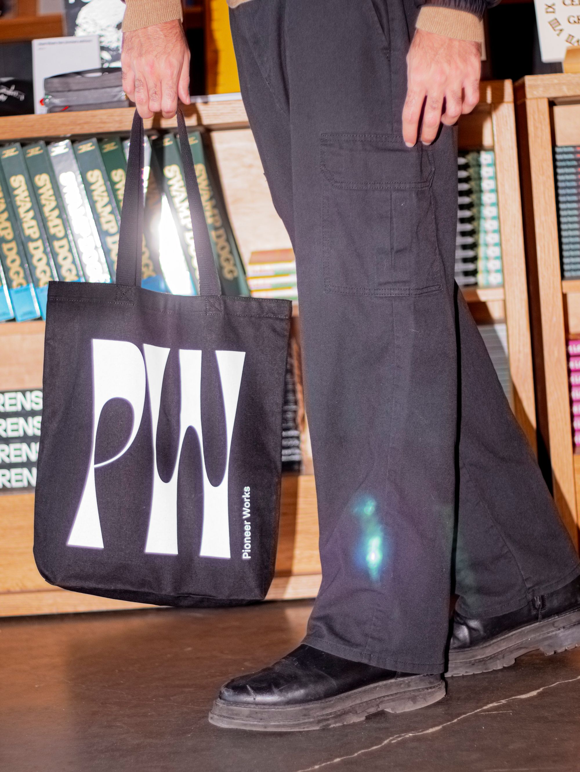
A Pioneer Works tote in the bookstore.
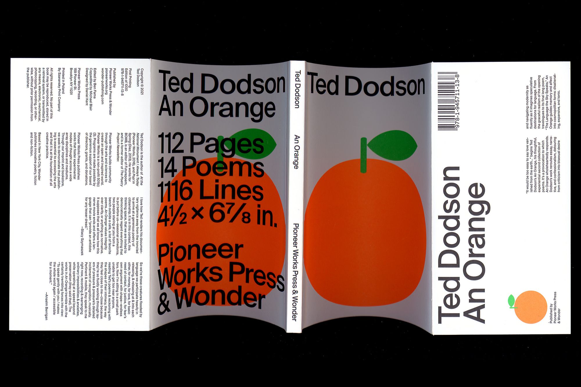
Ted Dodson, An Orange, scanned book cover. Published by Pioneer Works Press, 2021.
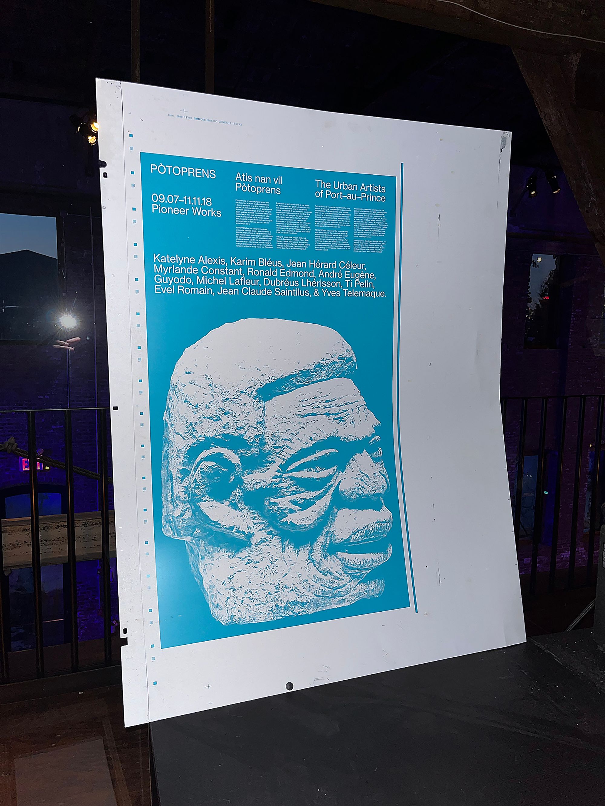
Lithographic printing plate for the PÒTOPRENS: The Urban Artists of Port-au-Prince exhibition poster, Pioneer Works, 2018.
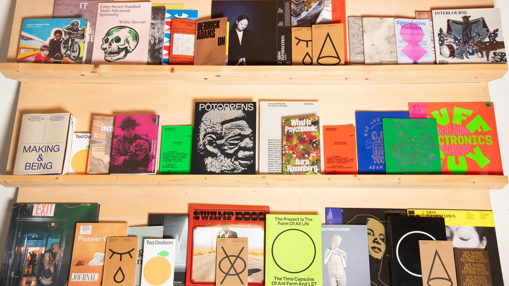
Assorted titles from Pioneer Works Press, captured on display in the Design Lab.
Pioneer Works hat, embroidered cotton, 2021–2022.
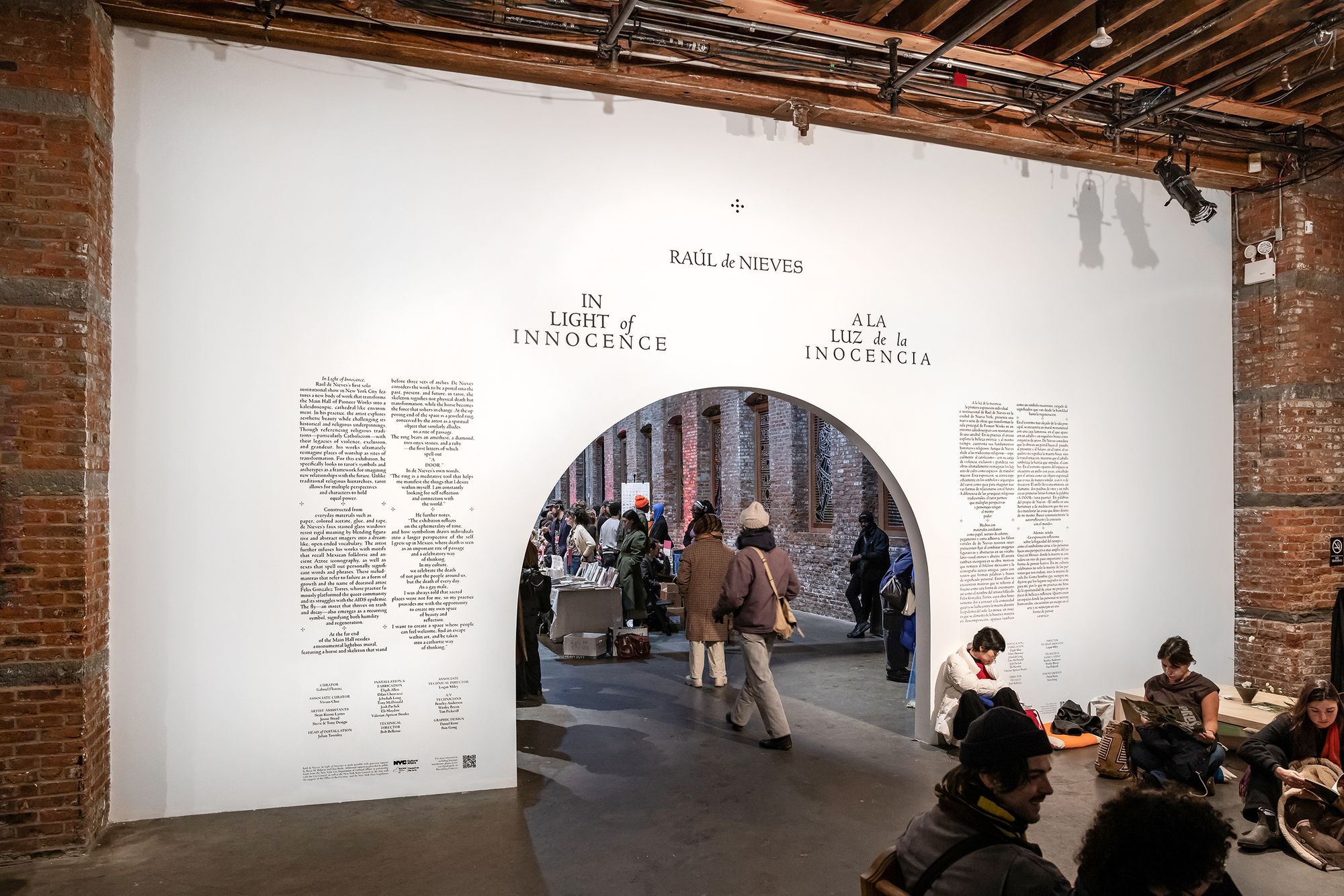
Installation view of Raúl de Nieves’s exhibition title wall for In Light of Innocence, Pioneer Works, 2025.
Model wearing a Pioneer Works shirt in the garden.
Program designed for Press Play 2025, produced as individually unique, editioned pieces.
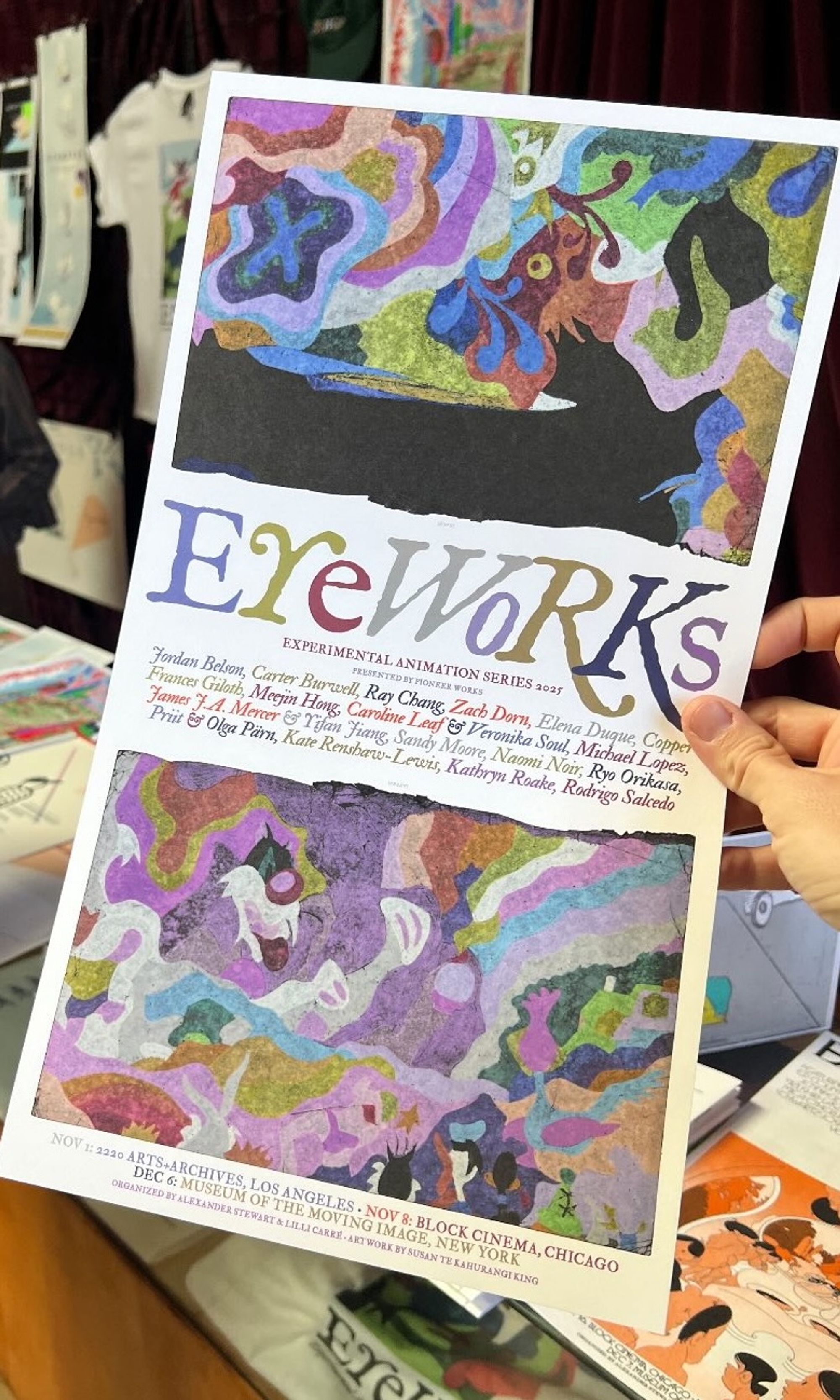
Program designed for Eyeworks, 2025.
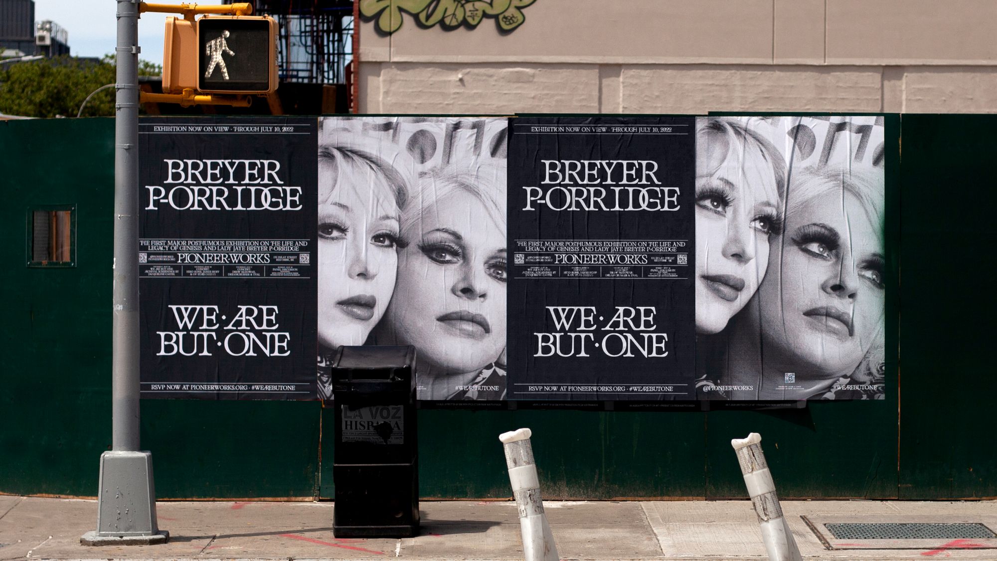
Wheatpasted street posters for BREYER P-ORRIDGE: WE ARE BUT ONE, 2022.
Interior label from a Pioneer Works sweater.
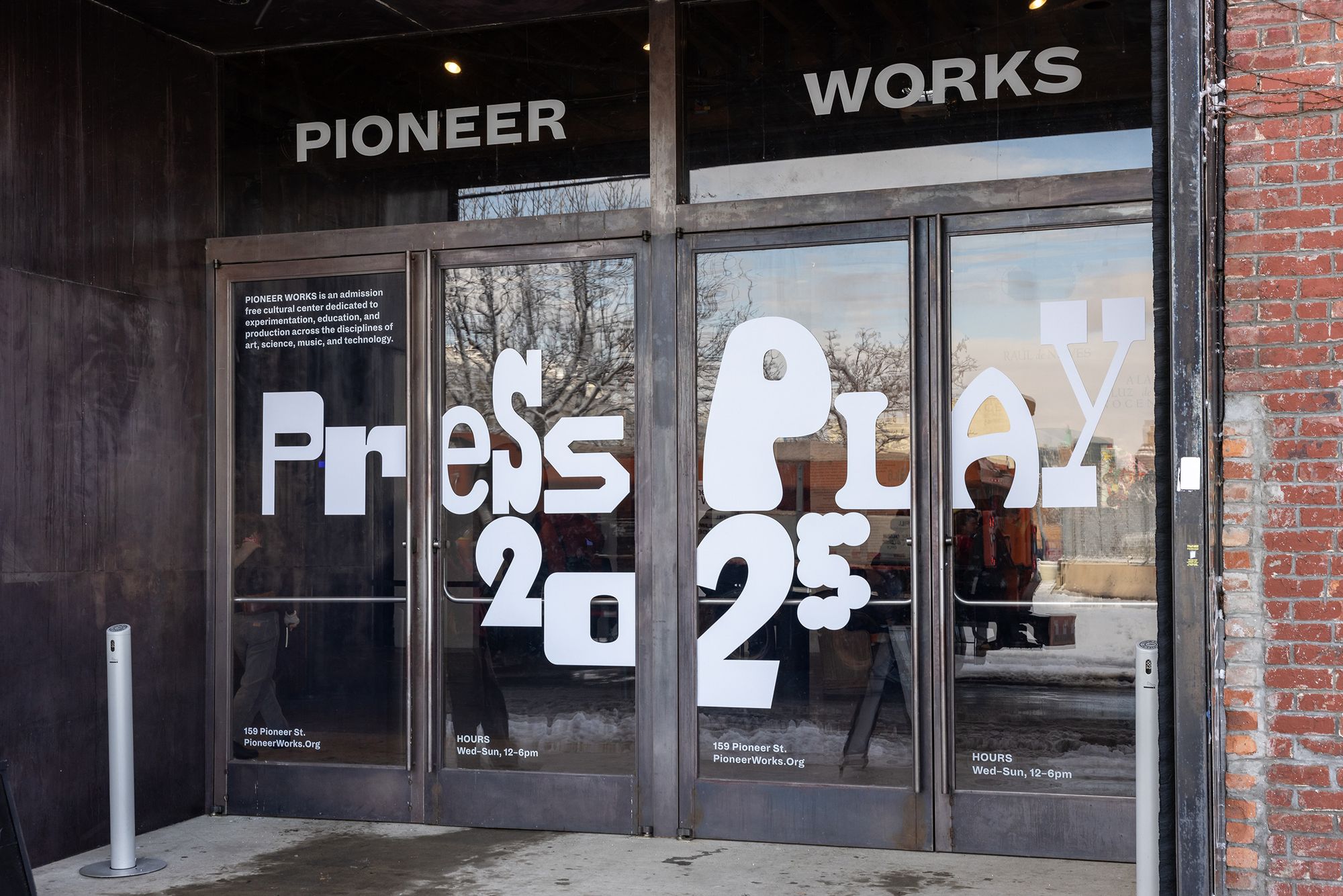
Entrance decal for Press Play 2025 at Pioneer Works.
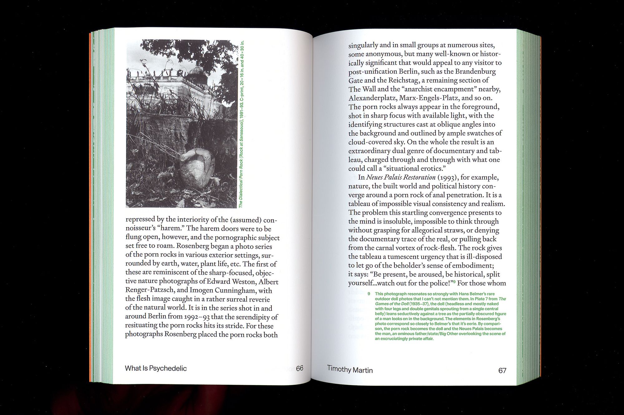
Aura Rosenberg, What is Psychedelic, scanned interior view. Published by Pioneer Works Press to accompany the artist’s joint exhibitions at Pioneer Works and Mishkin Gallery, March 2023.
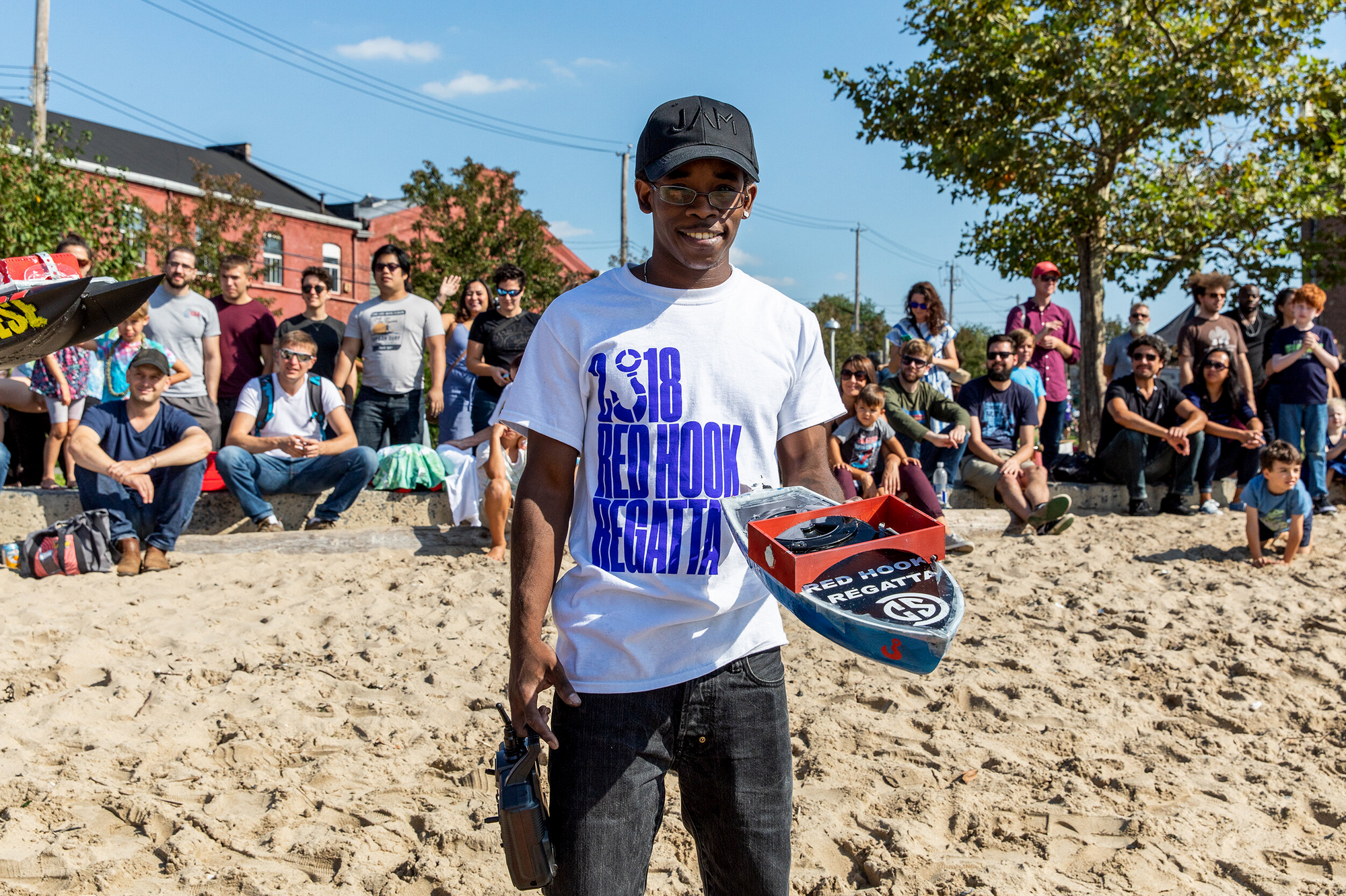
Laurenzo wearing his Red Hook Regatta T-shirt and holding his boat, 2018.
Anthony McCall & David Grubbs, Simultaneous Soloists. Pioneer Works Press, 2019.
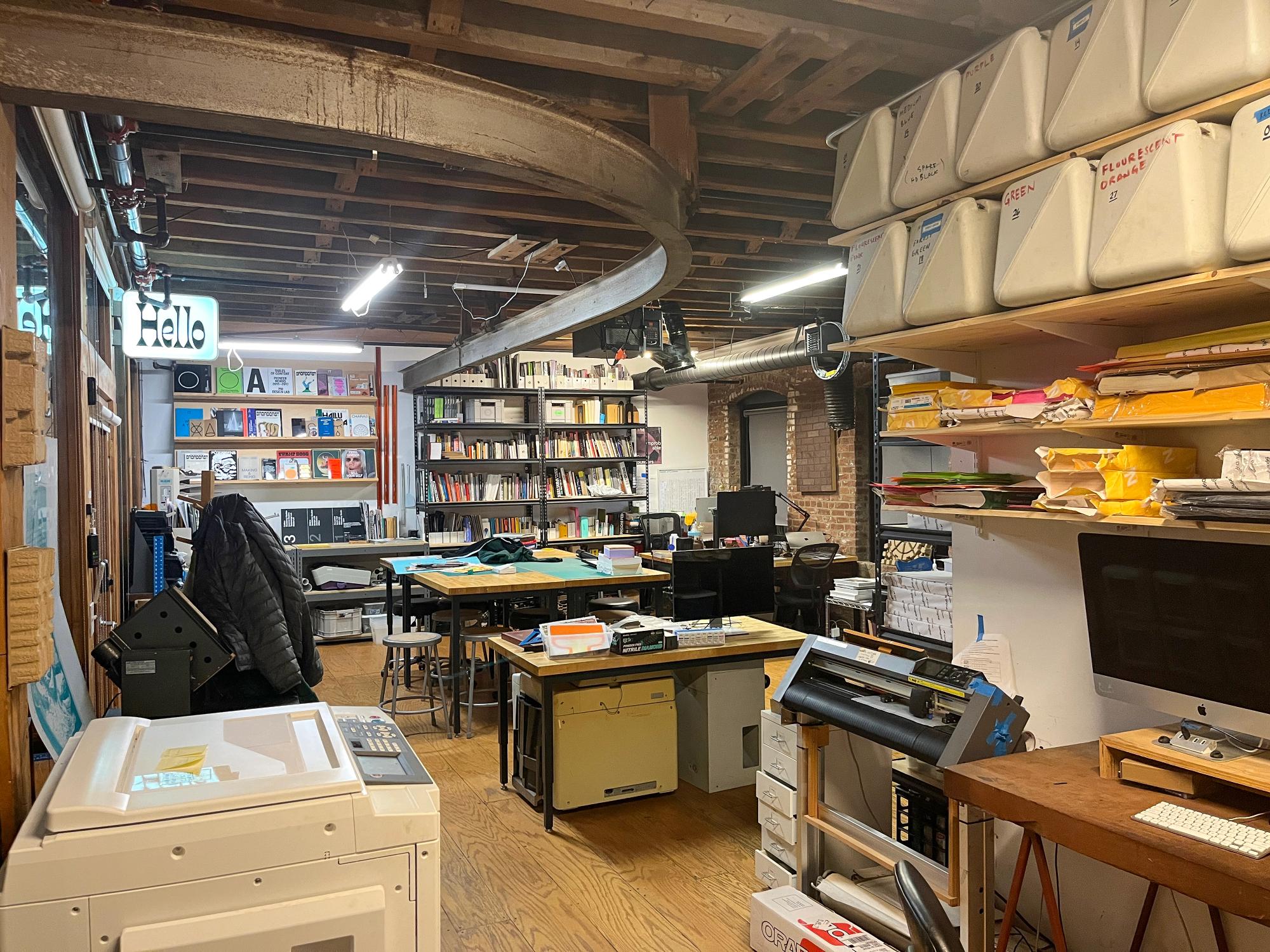
The Pioneer Works Design Lab, 2026.
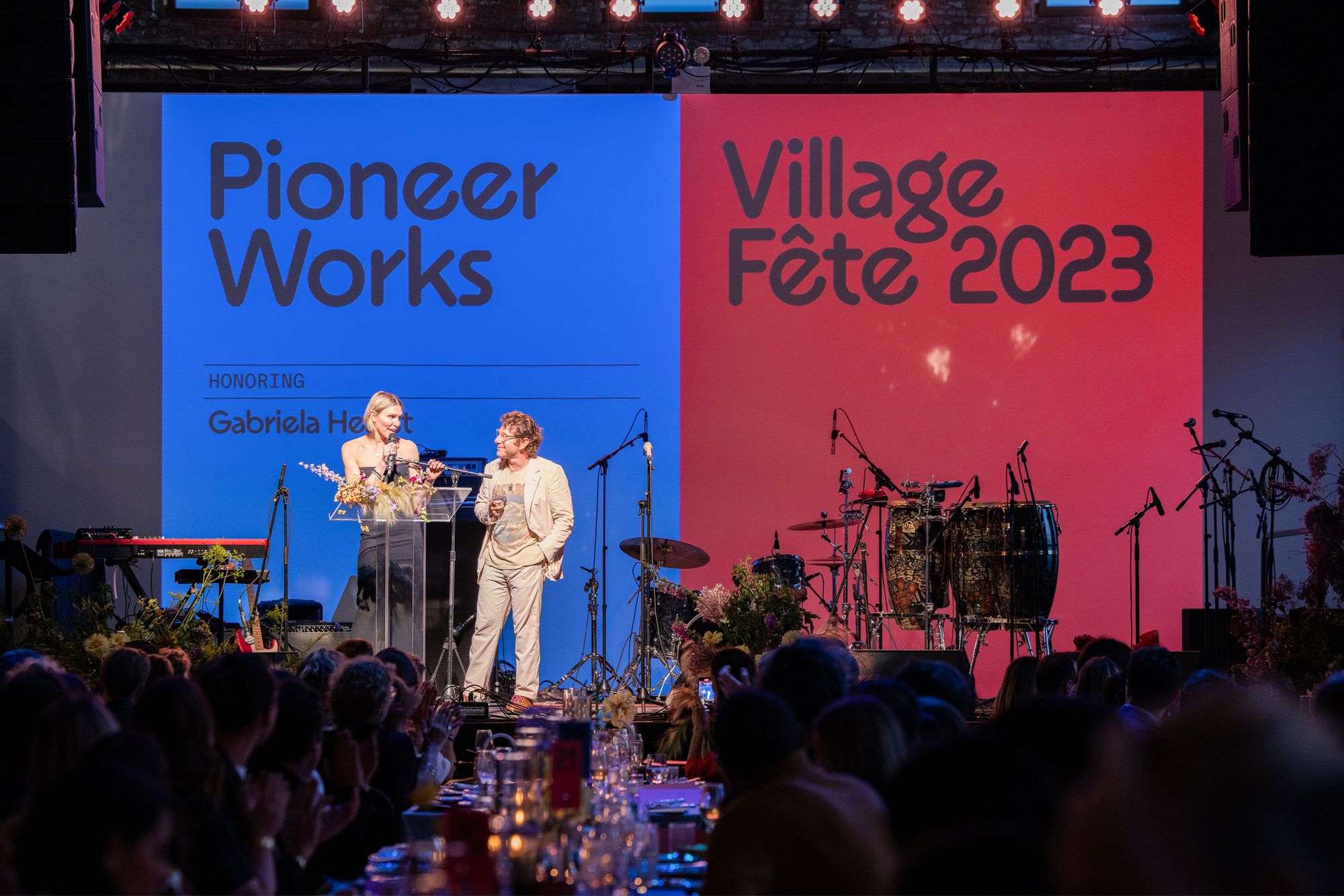
Dustin Yellin and Gabriela Hearst onstage at the Village Fête 2023, with custom event graphics projected behind them.
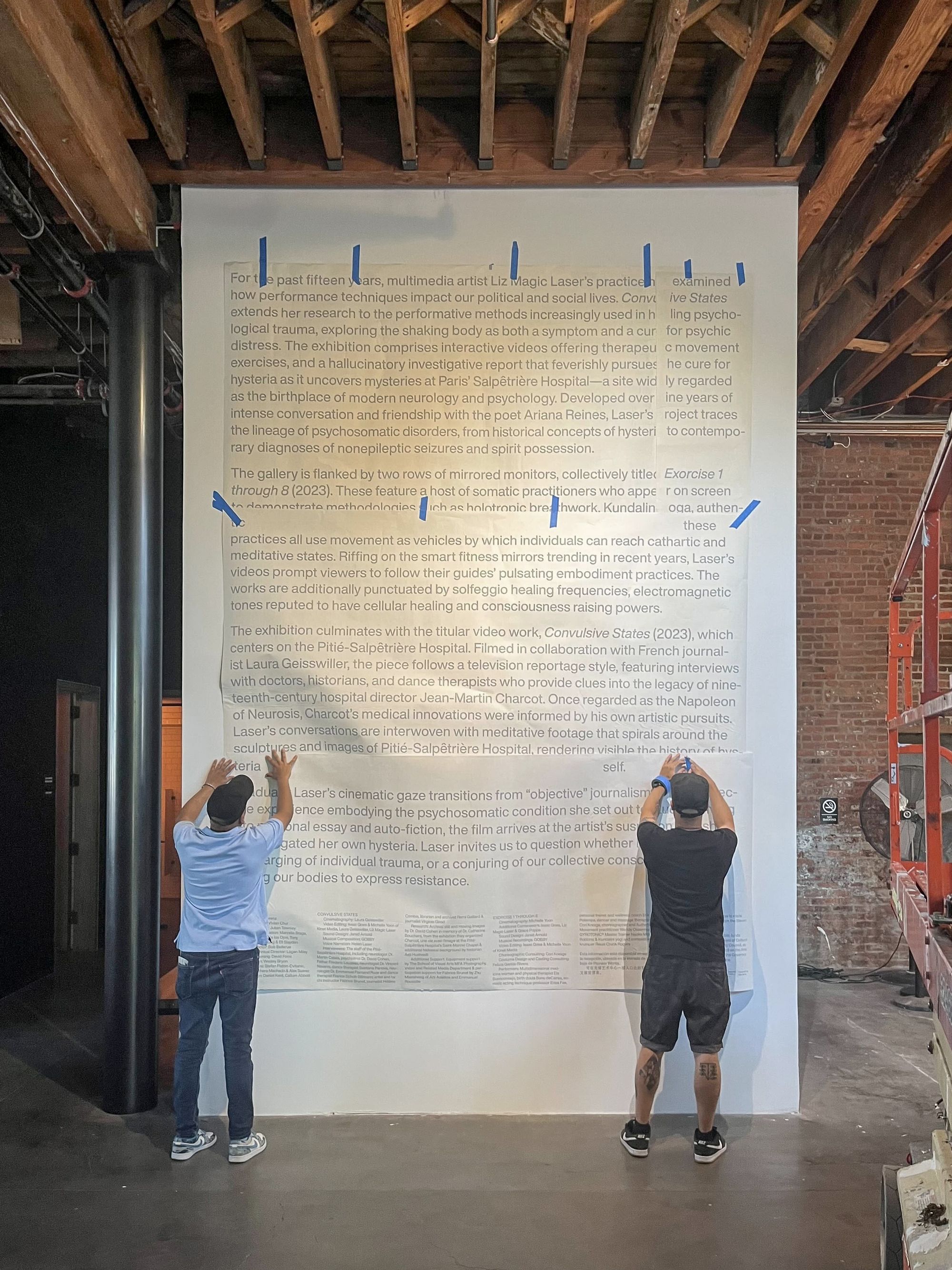
Vinyl installation for Liz Magic Laser's Convulsive States exhibition, 2023.
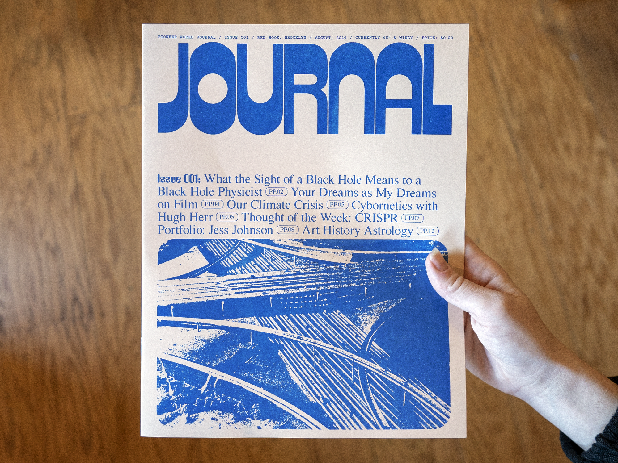
Early prototype of Pioneer Works Broadcast, 2019.
There are many other institutions that have magazines or publications, and they typically go in two different directions. The magazine either stays completely within the institution’s brand ecosystem, or it really stands out. We needed to make Broadcast accessible and available for free online, so the initial question was: How do we brand this in a way that feels appropriate to the variation and diversity of all the different voices that are involved in it—the breadth of published content and the types of topics touched on? Much of our design at Pioneer Works has been driven by our programs; it’s grown from experiments, and hasn’t been dictated by the institution or forced into a static frame. Pioneer Works, as a brand, is recognizable as more than the sum of its parts. So we made the decision that Broadcast would have a unique and a recognizable visual system within that Pioneer Works identity.
From there, I brought on Andrew LeClair to collaborate on the design, and he brought a bunch of experience and knowledge around online editorial design work and publishing. And I brought my knowledge of not only design at Pioneer Works, but the mission and spirit of the organization. My initial thought was that the magazine’s conceptual framework would be a dynamic system rather than being built from limited or uniform visual identifiers. Because we're a small team both at Broadcast and in the design department, we didn’t want to have to devote tons of time to designing every piece—to choosing a feature image, a headline and typeface, etcetera. We wanted to create an art direction system that functioned through the CMS, in a semi-automated way.
So the design and the fonts are the art direction.
Right. And for both, we were looking at a whole bunch of different references and publications from different eras—less contemporary magazines or websites than print projects from when publishing became more democratic and expressive because it was more affordable, in the 1960s and ‘70s, especially. I wanted to think about Broadcast more as a DIY print publishing project from the era when Letraset landed and dry transfer, pressed-down lettering became omnipresent. With print, just the fact that it's a static object means that you can be a lot crazier with it. You can give headlines different typefaces for each article. You can mess with the layout in all kinds of crazy ways, you can do all this stuff that you can’t do on the web. A webpage needs to work on the phone, it needs to work on a desktop, it needs to autopopulate in all these different places in a modular way.
So I was looking at a lot of that stuff from when Letraset came in. Prior to that, to make a zine you either had to use a typewriter and photocopy it—and maybe draw some bubble letters if you wanted to distinguish headlines or create some type of hierarchy—or you'd have to go to a typesetter and get it actually produced. When press-down lettering became a thing, you could just go buy Cooper in 24 points and then press down your title at any angle or in whatever way you wanted. So suddenly all these DIY zines became more type-expressive. There was just a lot more zaniness. A lot of the typefaces we use on Broadcast are actually much older, from the turn of the twentieth century, but we associate them with the 1970s because that's when they became widely available outside of the really niche, professional design world.
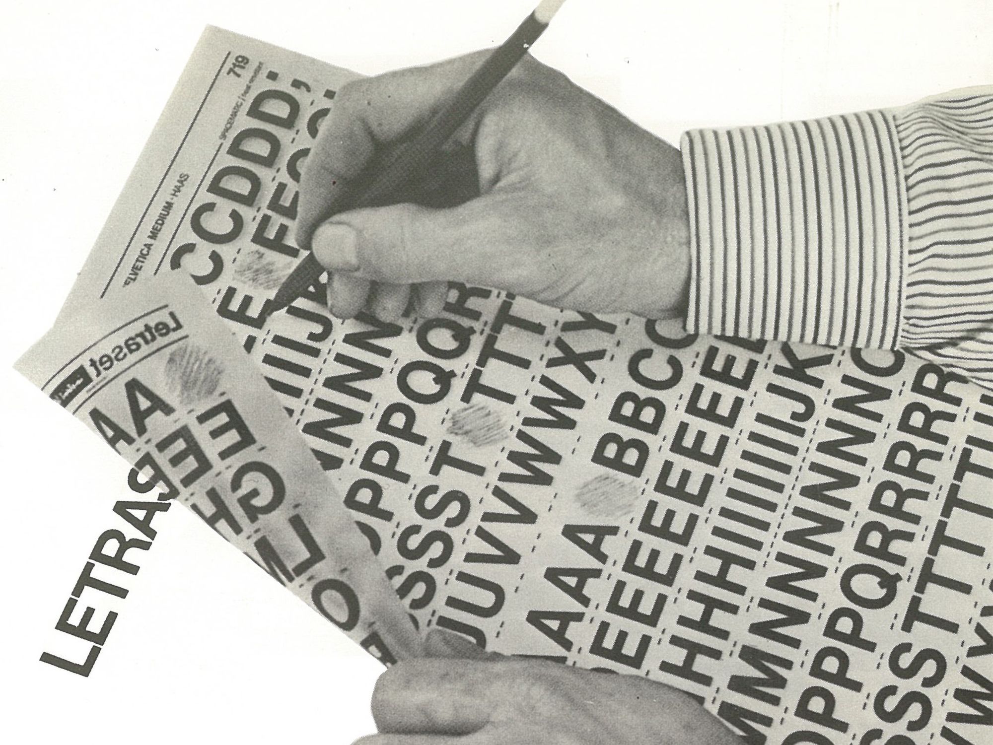
Sample image showing Letraset dry-transfer technique.
That moment of print culture was the reference and key inspiration.
Yes, and it’s in parallel with what’s currently happening in typography, which is that its production has been democratized. Where there were once these big foundries that literally made metal typefaces you had to buy—because they were physical pieces you couldn’t produce yourself—now they’ve been digitized. Anyone now can download the software needed to design a typeface. There's been a huge Cambrian explosion of independent type foundries that sell fonts on the web.
So, with Broadcast we wanted to take that explosion as a jumping-off point, and figure out a basic framework, or scaffold, where you could build in all this expressiveness and all these typographic voices. We developed the initial structure of articles, homepage, all of the discipline pages—all the components of the website—and then figured out the type sizing and hierarchy. After standardizing everything using a single typeface, we went out and licensed about 70 fonts that would automatically swap in for the stock headline font based on the way we coded the website. Every article that’s published receives a different typeface at random, drawn from buckets of typefaces that we allocated for each discipline. So there are a bunch for Science, for example, but you never know which of them you’re going to get until you hit publish. And then there was an additional layer with an article series; those would get assigned a typeface and that typeface would be exclusive to that series to create a consistent identity.
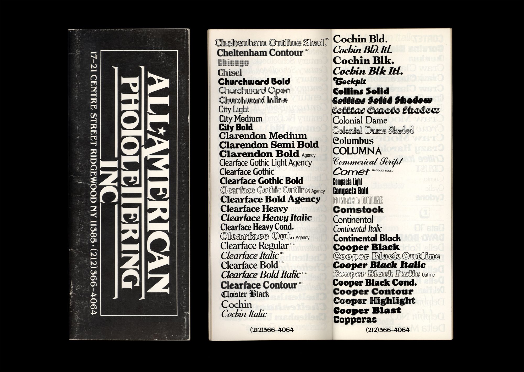
An old catalog from All American Photolettering Inc in Ridgewood, which helped inspire the Broadcast font library.
Broadcast uses a huge variety of distinct typefaces for our headlines. Was there a specific inspiration for juxtaposing varied fonts in this way?
Yes, one was this catalog from a print shop in Ridgewood, from a few decades ago, that somehow wound up here at Pioneer Works. It was a random phototypesetting shop—one of hundreds in New York in the ‘70s and ‘80s. The catalog is a type specimen. Letraset would've had similar catalogs, and there were a bunch of alternate companies that offered similar things. But this one in particular ended up being a key reference when we were creating the Broadcast project, chiefly because it showed all of these print typefaces alphabetically. You see so many headlines together and it's really interesting; there’s a general rule in design where you try to limit the number of typefaces you use on a project. You’re taught to keep fonts and sizes—and their pairings—consistent and limited. And you can see why this rule exists; if you imagine a publication with, say, four or five random fonts, it would just seem excessive and arbitrary. But something interesting occurs when there’s much more than that. When it's 50, then it's like, “Oh, now there's this whole other visual system happening.” Rather than focusing on each one individually, looking at so many at once creates a larger tapestry which becomes its own visual field.
Early examples of Broadcast fonts, 2020.
Clearly you have a deep passion for print. What was it like moving this web publication to physical form? I’m holding the first Broadcast print issue, which was very much like a high-concept, upmarket zine, and then the second one was thicker and more substantial. So it became a kind of circular process––the visual inspiration for the website was print culture, and now you’ve turned the digital platform into a beautiful print magazine.
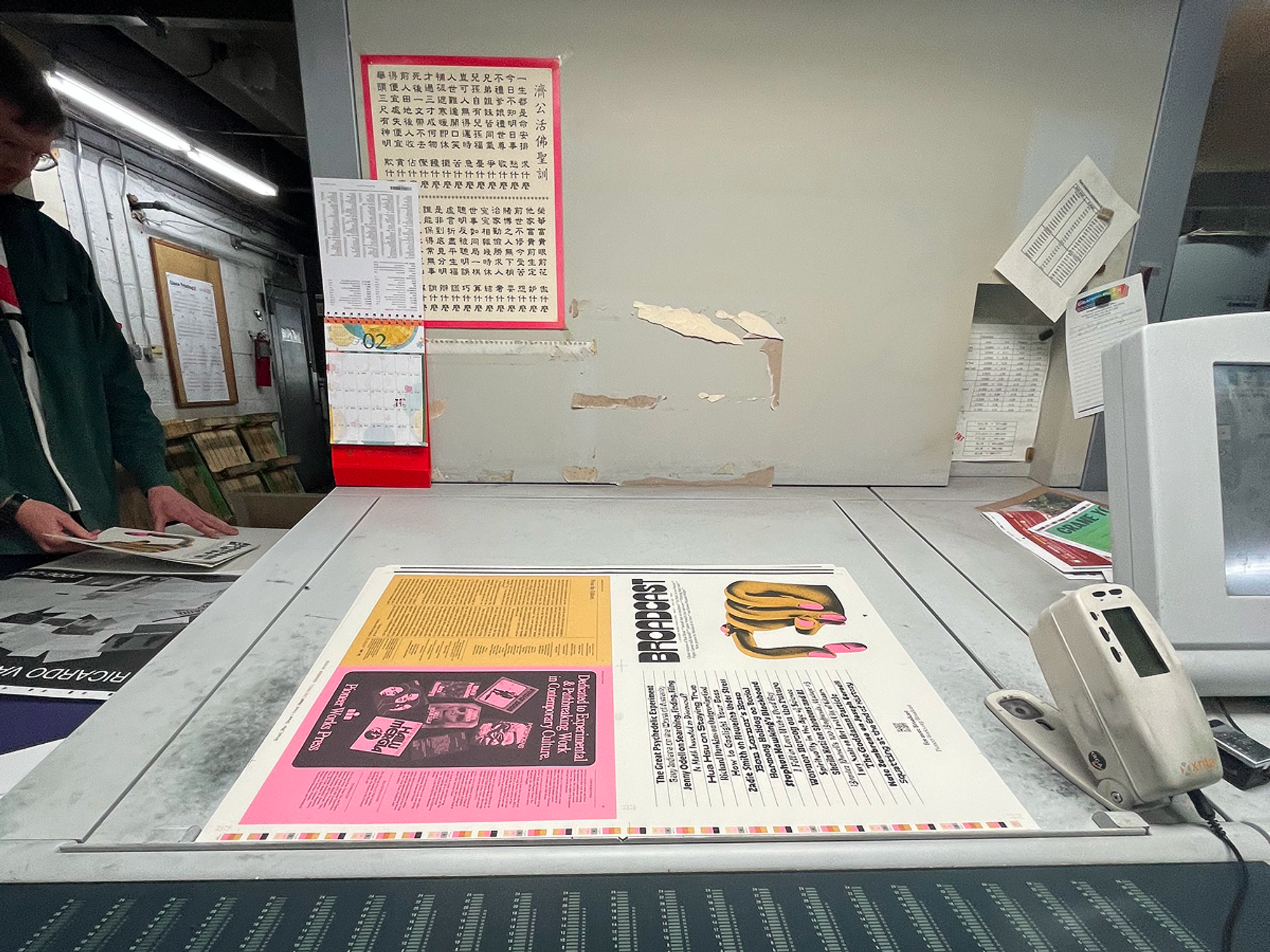
Broadcast Issue 01 at the printer, 2023.
Photo: Mei LenahanThe initial goal for this digital publication was to take its references from print. To lay out typefaces for print, you typically use InDesign to scale and move the type individually, whereas the website is a system where the type needs to be standardized. So going to print, we got to twist all these knobs we weren't able to control on the web. We could actually editorialize each of the articles to a degree that’s not possible online. We could make a range of different decisions for each piece—and also return to one of our earlier ideas for Broadcast generally, which was to give images a print-like treatment.
Online, we decided it would be too limiting for the homepage to be populated with just two-color images, an idea we initially toyed with. But as we turned to print, we decided to echo zines of yore by limiting the whole magazine to three colors, which will always be black and then two spot colors.
Broadcast Issue 01, complete scan. Pioneer Works Press, 2023.
That mimics what you’d make on a Risograph, like the one we have at Pioneer Works—this machine from the 1980s that combines a screen printer with a photocopier. Each color of a printed piece is essentially one “screen” you run over thousands of copies, then you set another layer of color over the other color, running each layer of color until you have the finished piece. The effect looks a little wonky and imperfect; blemishes and faded bits are part of the technology’s appeal.
We initially thought we’d print the physical magazine in-house, on our own Risograph. It became a bigger project, so that wasn’t tenable. But we brought that same color limitation to Broadcast’s print publication, as another way of signaling that we're embracing this idea of imperfection and limitation. These technological restraints are an important part of the project and its aesthetic.
These visual references also evoke, for many, a certain era—the ‘70s, specifically. I know you’re keen not to think of Broadcast as “retro”: it’s important that the project feels contemporary. But it’s also in conversation with the past visually, and with this era that was kind of a hangover from the ’60s. It was a decade with a rough economy, rougher drugs—but also the rise of punk and a countercultural and DIY ethos that is also in the air at Pioneer Works, but with really high production values. One thing you’ve done with Broadcast, in a way, is to bring those two worlds of high and low together.
We're not going to Kinko's with a cut-up little thing, as fun as that sounds. Broadcast is still relatively scrappy in terms of its scope, both in the size of our team and the budgetary realities of being a nonprofit. But that can work to our advantage, and hopefully the design speaks to that.
I also wanted to talk to you about moving from Issue 01 to Issue 02 and now Issue 03. The second and third print issues maintained much of the same template from the pilot, but they became thicker and more permanent-feeling because we committed to making them on an annual basis. We wanted our magazines to feel a little more substantial. We wanted Broadcast to become an object that people would really want to live with for a while, like a Whole Earth Catalog. While the actual issues became a bit bigger, they continued to share the same design sensibility. In the second issue we had this Adderall feature by Daniel Kolitz, about the larger impacts of Adderall addiction and dependence on culture. It was a part of a larger collection of Adderall essays, “Club Med,” that were honored by Best American Essays, and which PW Press will publish as a book. The design of this print feature in particular was nominated for a National Magazine Award. I wonder if you could just talk about the font you chose, and the striking pill layout that you and Callum Abbott designed.
I guess you could say that I’ve been shying away a bit from the granular fetishization of these design choices. I’m wary of becoming some sort of font sommelier, like when you’re at a restaurant and you ask, “I want something that can go with the chicken."
You look at stuff and make stuff.
It’s intuitive. I just sort of do it. The Broadcast font is called Zipper. It's a reverse contrast typeface, first released by Letraset but initially very popular in Italy. The contrast emphasis is the opposite of a typical serif typeface where the letters’ vertical parts are heavier or the same weight as the top and bottom horizontal elements. So with Zipper, the horizontal parts are really thick.
As for “Club Med,” we initially published the piece online and Callum did a bunch of editorial illustrations for it, the main one being a smiley face made of Adderall pills with a gradient background, which was really great. We wanted to use that for print, but we didn't have the full color spectrum and we needed it to be more high-res. So we replaced the pills and then we needed to choose a different typeface direction. I was thinking about twentieth-century anti-drug PSA campaigns.
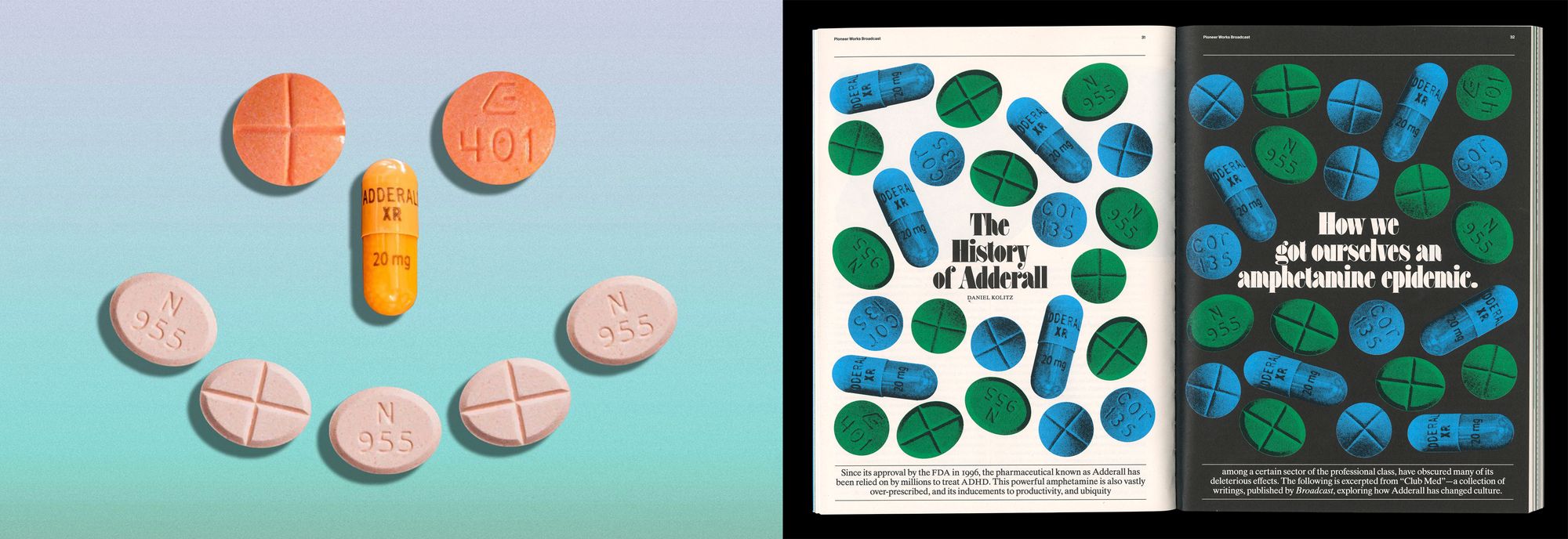
The digital header image for Club Med, shown alongside the design treatment for the article in print.
“This Is Your Brain on Drugs.”
Yes, and those always strangely had the best designs, because I think designers or creative people are inherently iconoclasts, almost categorically. So they had a lot of fun with those projects, and made them really zany-looking and actually kind of great.
The article’s design treatment feels like a PSA or a poster.
Yes, it's taking visual cues from that sort of vocabulary, with its typeface and the way that we set the opposite pages, black and white, and then ran the subhead as two messages to each other, one positive and one negative, in ITC Fat Face, a display typeface from the ’70s. It's made to look super huge because it has a really exaggerated contrast; the tips of the serifs are super thick, and the thin lines are so thin. Just in terms of absolute size they're really small. So they don't distinguish themselves well unless they’re physically…
…on a poster or billboard.
Yeah, really large. You wouldn't lay out a book with that type. It'd be much too hard to read. It's only for setting large headlines.
Broadcast, Issue 03, Cover, 2026.
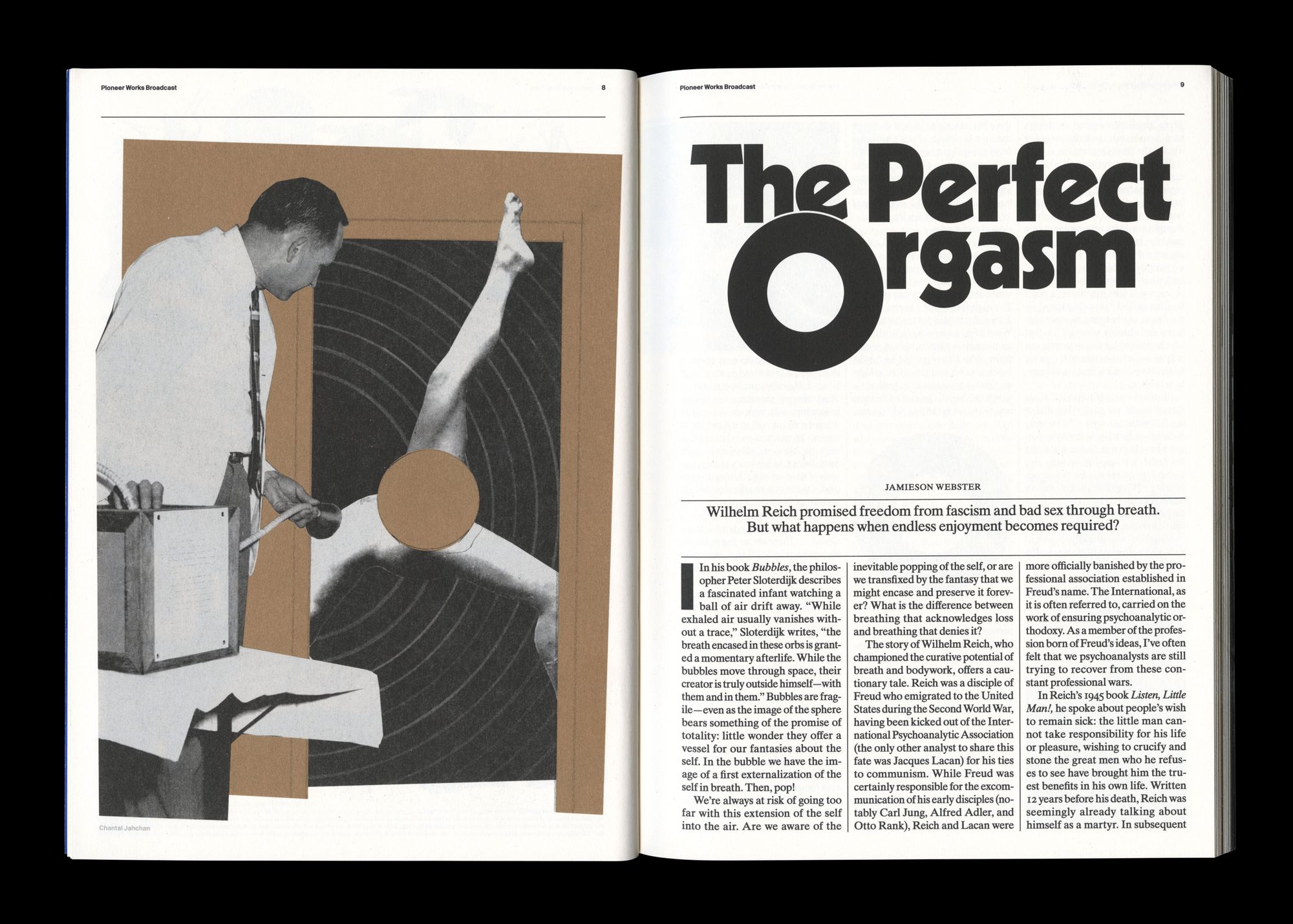
Broadcast, Issue 03, "The Perfect Orgasm," 2026.
Broadcast, Issue 03, opening page, 2026.
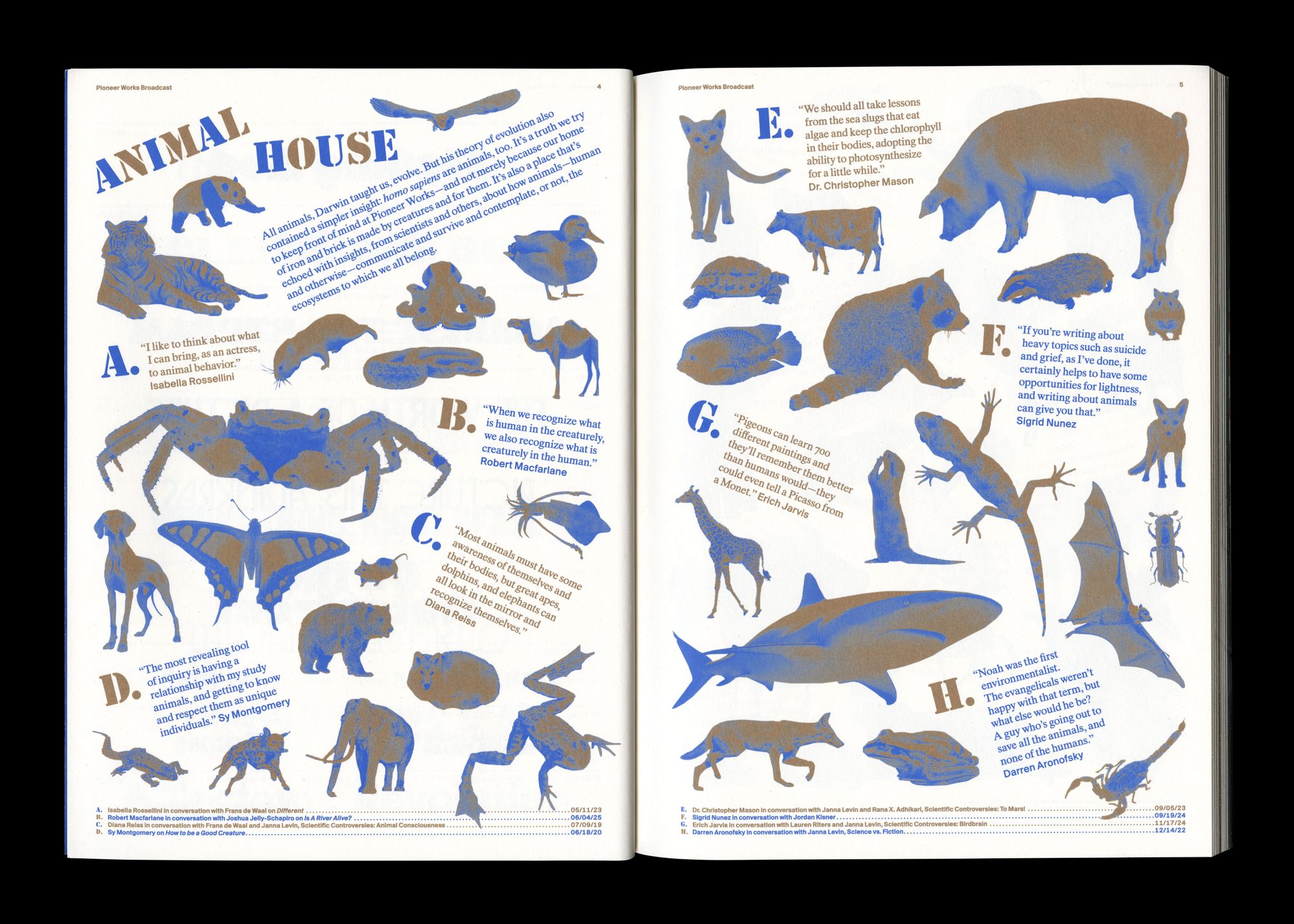
Broadcast, Issue 03, "Animal House" spread, 2026.
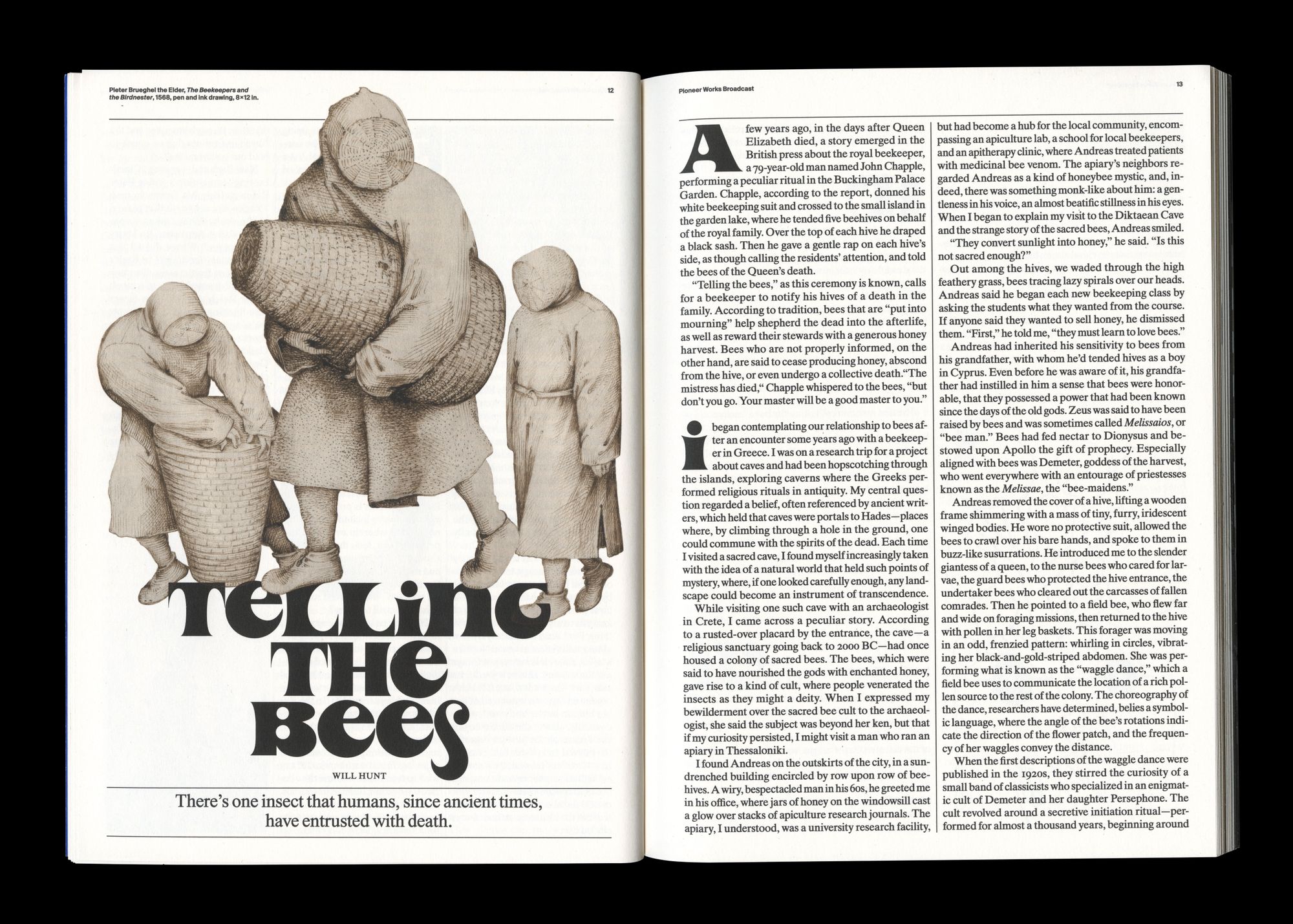
Broadcast, Issue 03, "Telling the Bees," 2026.
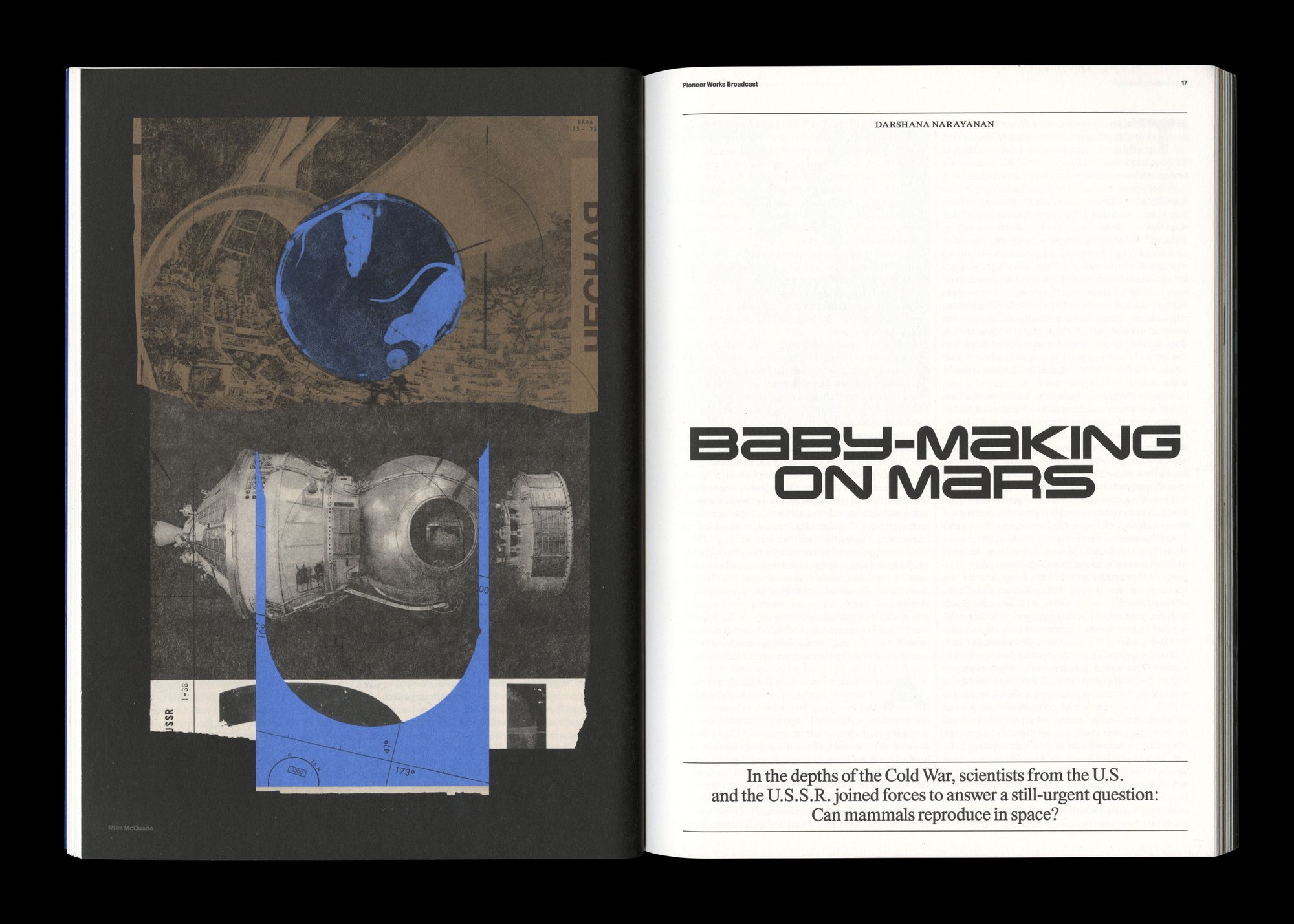
Broadcast, Issue 03, "Baby-Making on Mars," 2026.
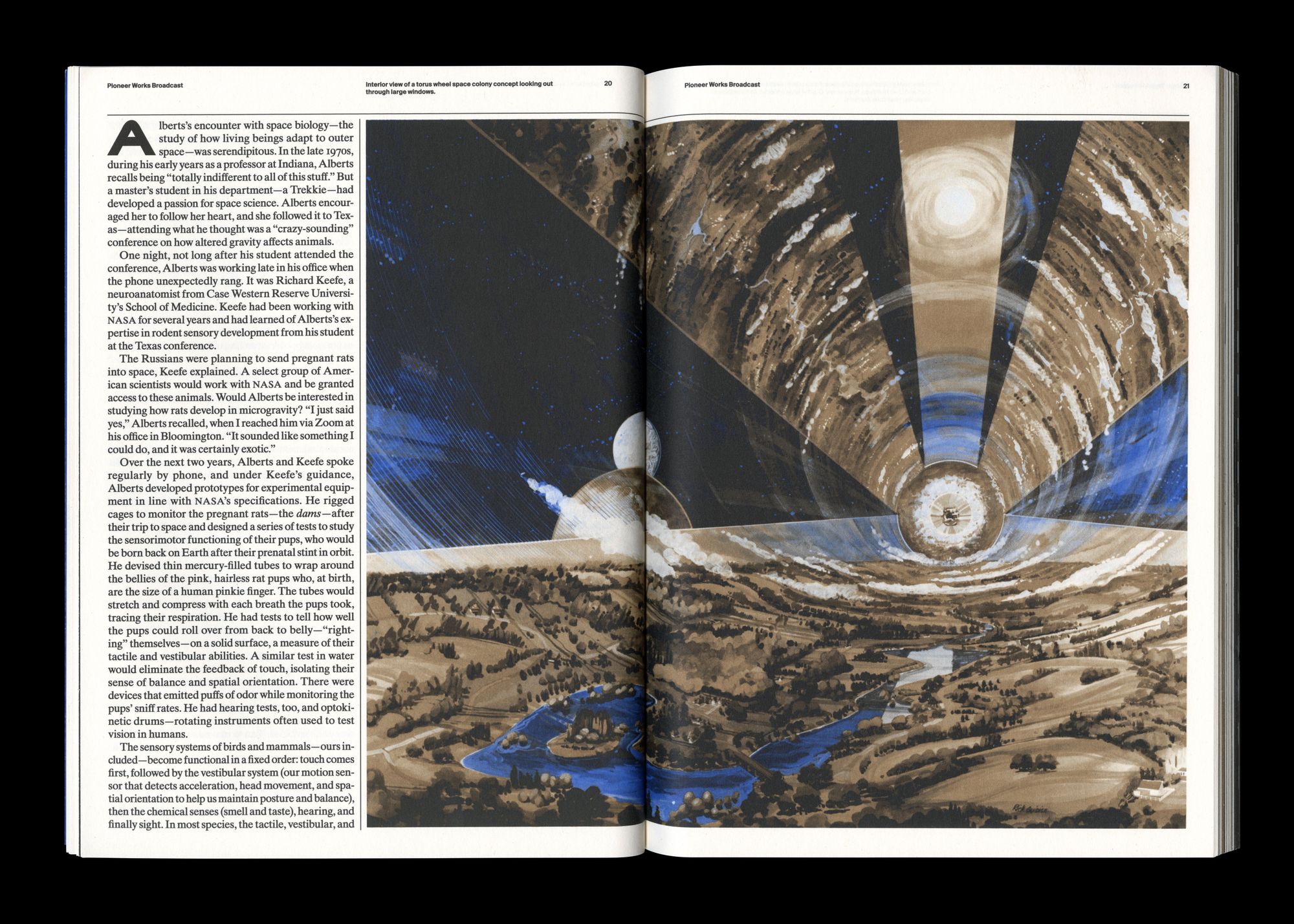
Broadcast, Issue 03, spread from "Baby-Making on Mars," 2026.
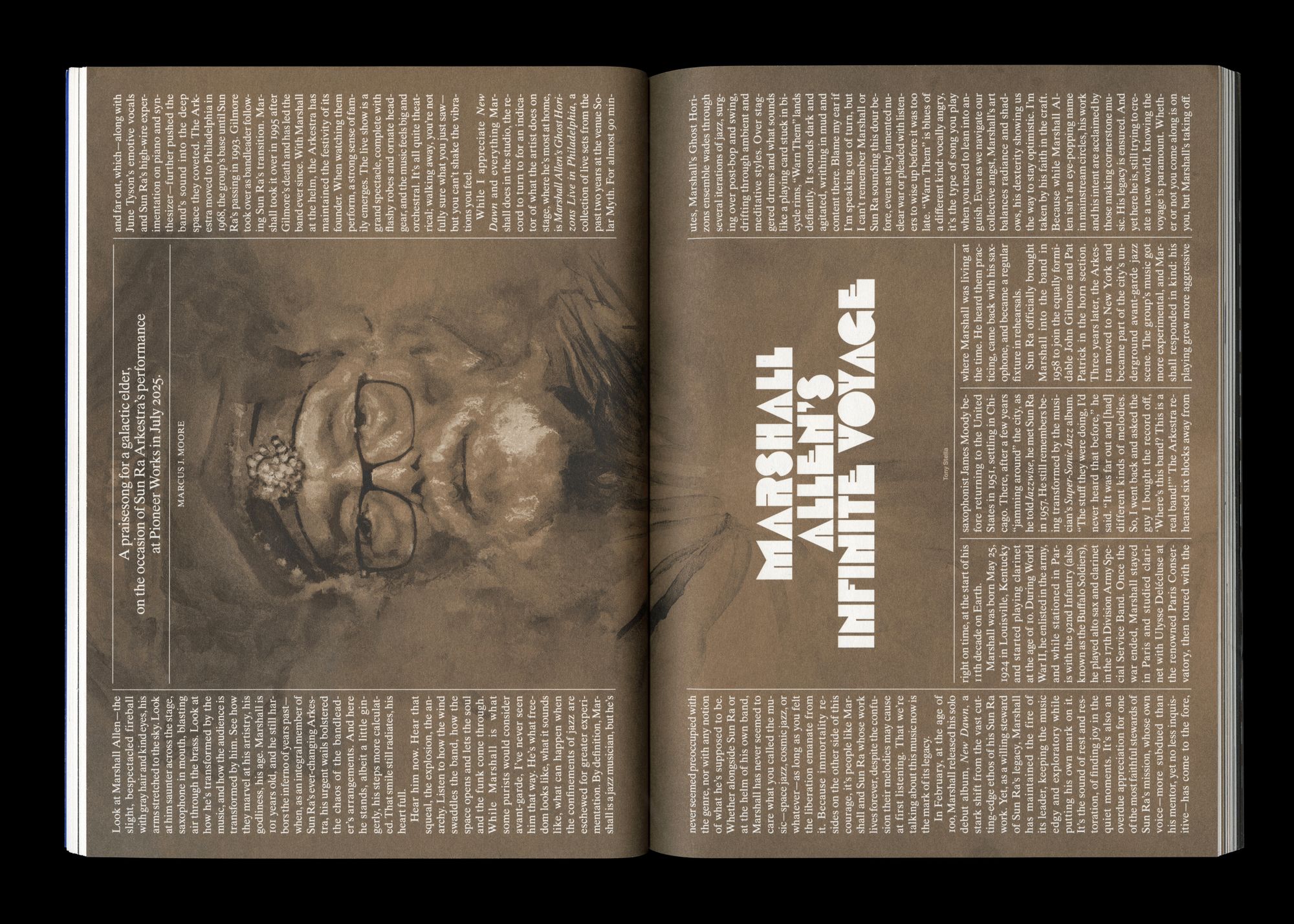
Broadcast, Issue 03, "Marshall Allen's Infinite Voyage," 2026.
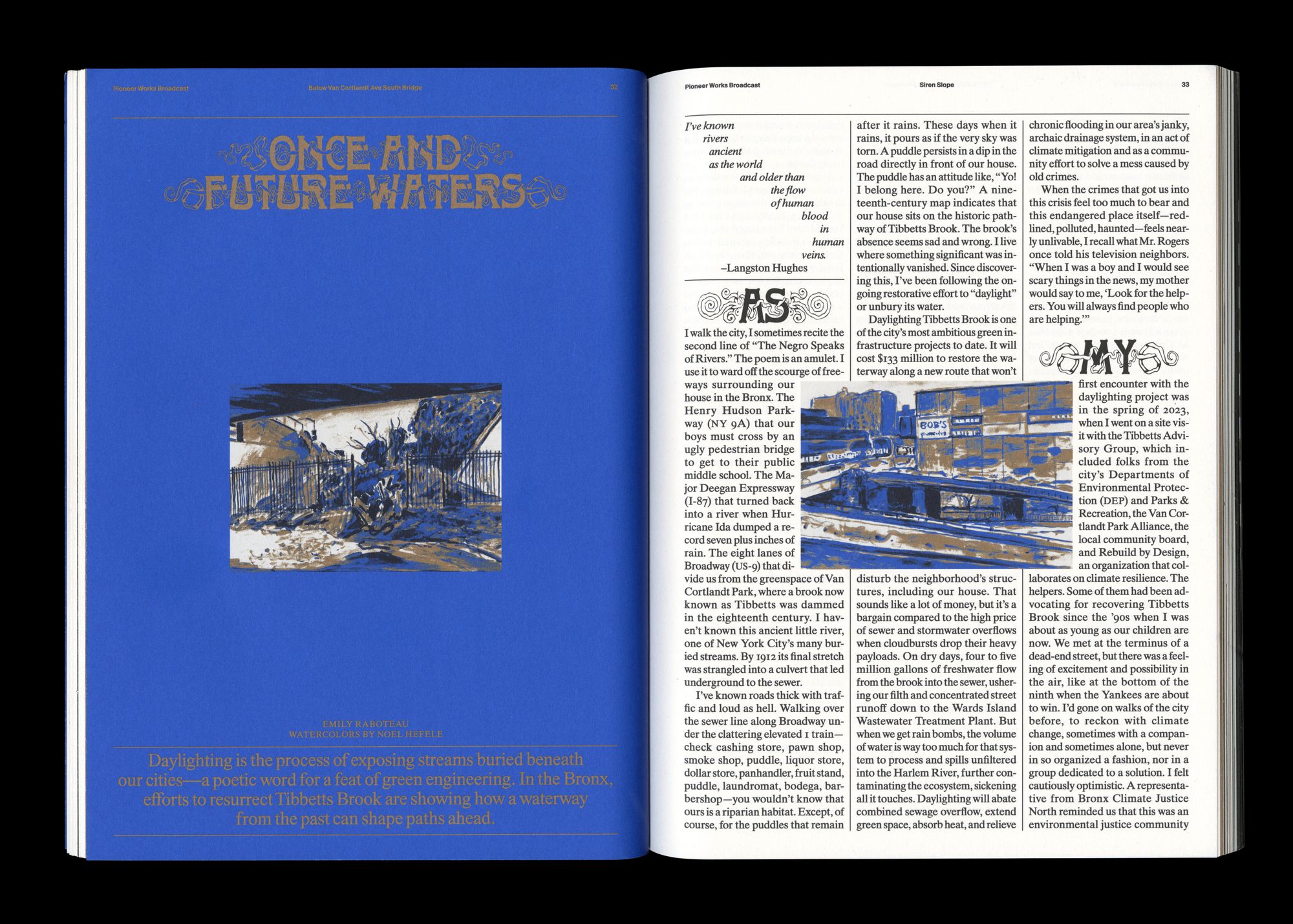
Broadcast, Issue 03, "Once and Future Waters," 2026.
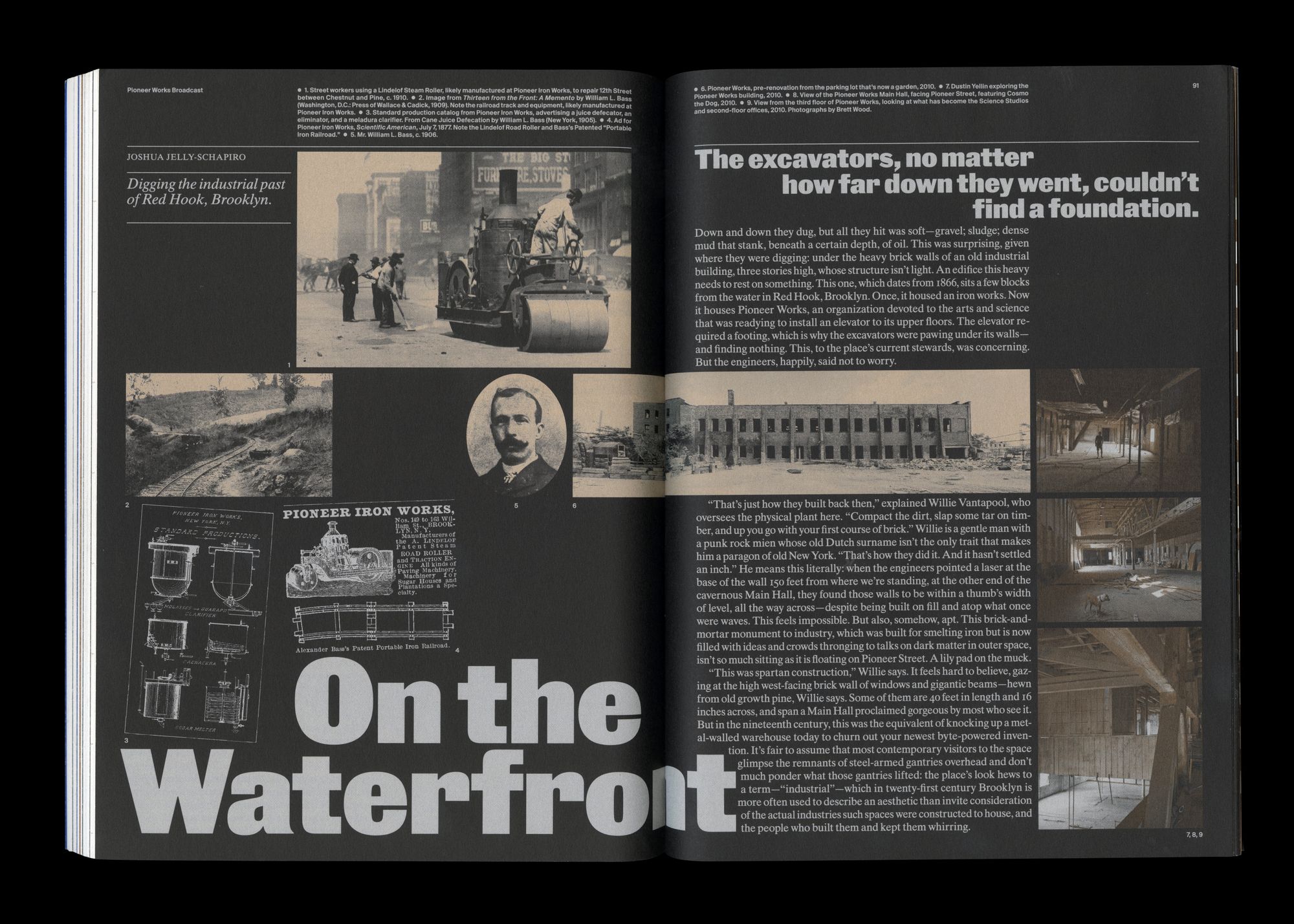
Broadcast, Issue 03, "On the Waterfront," 2026.
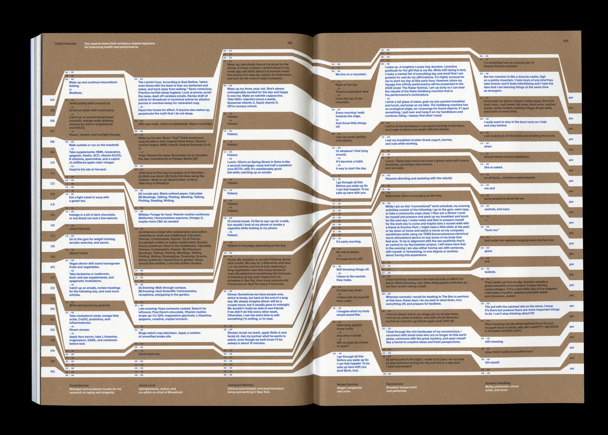
Broadcast, Issue 03, "Protocols" spread, 2026.
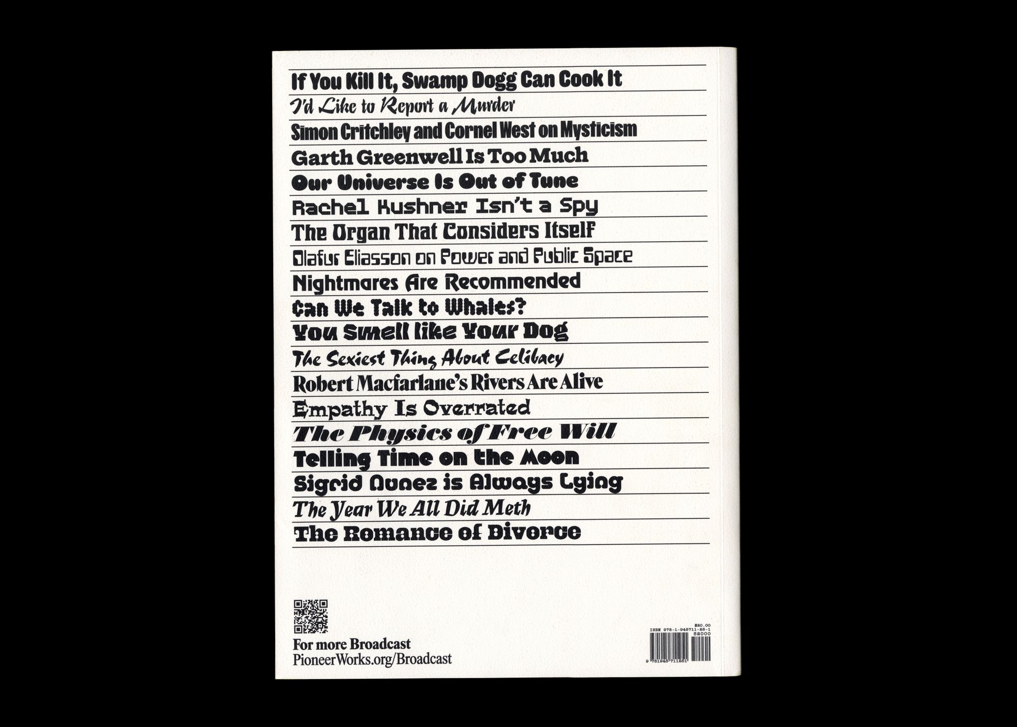
Broadcast, Issue 03, Back cover, 2026.
So this project began with the web, then we had a print issue, and then another print issue. And now we have a third, which you’ve put together with Son Gong, our brilliant new Senior Designer. The magazine continues to grow and evolve. We're getting it around because we have distribution now. We’ve received awards. With a publication like Broadcast, what does success look like for you?
I think ultimately what success looks like is whether our contributors want to show it to other people. Does it speak to the audience we're trying to engage with? When people see the magazine out in the world, it has to have some degree of shelf appeal, some amount of distinction from everything else. We're always trying to balance our personal ambitions against the goals of the project, but ultimately whether or not it has value depends on whether it has an identity that’s harmonious with the actual content of the magazine. When we hit that, we can be proud of the work we’ve done. ♦
Subscribe to Broadcast