Barnaby's Futura Fantasy
In 2012, Errol Morris conducted a quiz in the New York Times to ascertain whether the paper’s readers were optimists or pessimists. The quiz was a ruse. In a follow-up essay, Morris revealed that his aim was to determine whether different typefaces affect credulity; that is, whether one typeface is more likely to make you believe something is true. The experiment was rather unscientific, but the results were fascinating. Morris found that minor differences between typefaces can suggest distinct “personalities” among them and that there is in fact a typeface that nudges us, as he puts it, toward believing a statement is factual (it’s Baskerville, if you’re curious, and its obverse is, of course, Comic Sans). Most intriguing was the question he posed about the connection between the emotional resonance of a typeface or script and a text’s meaning: “Can we separate the form of the writing from its content?”
The same year Morris ran his experiment, I visited Fantagraphics, the Seattle-based comics publisher, at the publishing conference Book Expo. At their booth, I looked at the forthcoming first volume of the collected Barnaby, the comic strip written and drawn by Crockett Johnson from 1942 to 1952 (minus a roughly 20-month interim during which he consulted with a substitute writer and artist). Eric Reynolds, Fantagraphics’s associate publisher, stood with me over the book, and together we admired Johnson’s flawless drawings.
We also reflected on the idiosyncrasy of the comic’s typeset speech. Johnson, who began his career as a political cartoonist and went on to be a prolific writer and illustrator of children’s books (such as his most famous creation, Harold and the Purple Crayon), made the unusual decision to set the comic’s dialogue in a typeface instead of lettering it by hand as was then standard practice. Reynolds is a longtime fan of Barnaby and, with Crockett Johnson biographer Philip Nel, has shepherded four collections of the comic into print (a fifth and final volume is out this month). But when it came to Johnson’s use of a typeface, Reynolds was stumped. “It somehow just works,” he said. “It seems right.” It was a straightforward observation, but his comment took on a sudden significance: Johnson’s use of a typeface does work, but why? Like the comic itself, the answer lies in an amalgam of reason and imagination.
Barnaby is primarily animated by a quartet of characters: the boy, Barnaby Baxter; his fairy godfather, the loquacious and bumbling Mr. O’Malley; and Barnaby’s parents, who believe O’Malley to be a figment of their son’s imagination. Barnaby is the strip’s fulcrum, the pivot between his parents’ sober rationalism and the fairy-tale Mr. O’Malley (and his friends, including an ogre, a ghost, and an invisible leprechaun). The two worlds are also linked by language, which serves as a character of sorts because dialogue both constitutes the action of the strip (by driving it and reporting on it, as most events occur out of the frame) and occupies as much physical space in the panels as the characters themselves. The chief expender of words is O’Malley, whose “rococo eloquence,” as Jeet Heer has aptly described it, can fill an entire panel. The strip from November 3rd, 1942, begins just so: 13 lines of O’Malley’s dialogue push him and Barnaby into the second panel. Many of the strips are reduced from four panels to three to accommodate this abundance.

Barnaby strip from November 3rd, 1942.
Courtesy of Fantagraphics BooksLanguage is essential in the comic, and its physical appearance was as carefully crafted as the art itself. Howard Sparber, who was brought in to help ink Johnson’s daily Barnaby strips, recalls, in Nel’s biography, that the type “wasn’t just sort of dashed in. Dave [Crockett Johnson] would be writing the text as if he was counting characters in his head, because he knew he had to do five lines to fit into a balloon that would be over Mr. O’Malley’s head.” Johnson chose a typeface in order to fit more words into his speech balloons—some 60 percent more words, by his own estimation. The type he chose was Futura Medium Oblique.
*
The German typographer Paul Renner invented Futura in 1928. He was a member of the Deutscher Werkbund, an association of artists, architects, intellectuals, and industrialists founded in 1907 that debated the role of arts in society and sought to produce a uniquely German culture contra the rise of industrial modernization. Renner came to graphic design through painting and preferred the time, he wrote, when “every capable craftsman was an artist: every artist a craftsman.” He felt that good typography combined technology and art, rather than eschewing one for the other, and he “stressed the need for mechanical tools to be mastered with artistic sense,” as Christopher Burke writes in his excellent study of the typographer. Renner believed in the “eternal rules of artistic design,” whose expression he located in Cézanne’s dictum that “everything in nature models itself on the sphere, cone and cylinder.” From this simple foundation, Cézanne wrote, “one can do what one wants.”
Renner thought geometric shapes to be the “simplest and most contrasting forms” and based Futura on the fundamentals of geometry—letters formed from straight lines and circular shapes. The letter R, for instance, is composed of two straight lines and a half circle; g is a circle married to a straight line with a semicircle tail; and s consists of two half circles linked by a short, straight line. The strokes of Futura letterforms are monolinear (a line of uniform thickness), which produces a sense of evenness and regularity. In the final version of Futura, Renner amended the stroke junctions by thinning the curves where they meet stems (in the lowercase r and p, for example)—an instance of art improving the technological “perfection” of the compass. He also designed the type such that capitals are shorter than the ascenders of lowercase letters, meaning a lowercase k is taller than an uppercase T. The result is a more even distribution of weight—capitals don’t outweigh lowercase letters—and a script that is thought to be friendlier to the reader’s eye (but not so unbuttoned as, say, Comic Sans).
Johnson, too, was interested in geometry. Writing in the academic arts and sciences journal Leonardo in 1972, he seemed genuinely perplexed by what he saw as art’s neglect of mathematical geometry. “It strikes one as odd, especially so with the recent resort to the use of the computer by those who make non-figurative or abstract geometric paintings and drawings, that this or any art seldom has had more than a nodding acquaintance with the mathematics of geometry.” Suprematism, cubism, and Minimalism were surely not thoroughgoing enough for Johnson, whose hard-edge paintings of the ’60s and ’70s investigated famous mathematical theorems, such as the ancient Delian problem and the seventeenth-century Desargues’s theorem, and solved proofs of his own devising. In the painting Division of a Square by Conic Rectangles (1970), Johnson found he could change the shape and height of two of the rectangles, but could not then integrate the third in an agreeable way. Of the solution, he writes, “The coincidence of points and the sweep of the arcs all added up to a strong feeling that the construction, which was not expected to make any particular mathematical sense, was aesthetically ‘right.’”
In Barnaby’s case, the echoing of form and proportion between lettering and drawings suggests not only that the pictures are read as a kind of type but also that the words are read as pictures.
Geometric exploration is at play two decades earlier in his Harold and the Purple Crayon (1955). Harold is about the vast representative power of mark-making. A single line can suggest the horizon; two converging lines set at an angle to it can suggest a road cutting into the distance. From there, as Harold’s journey demonstrates, the possibilities are limitless. When Harold’s hand shakes from fear, his crayon creates a triangle wave, which becomes an ocean into which he plunges. In an effort to locate the window of his own room, Harold draws a city full of skyscrapers—a legion of rectangles filling the pages. As he tumbles through empty air, he begins drawing a balloon to slow his descent; the semicircle of the unfinished balloon echoes the curve of the crescent moon aloft in the night sky. Harold and the Purple Crayon may be celebratory of creative imagination, but it is also a paean to the wonders of geometry.
Johnson didn’t alight on typography and geometric aesthetics by accident. Before he embarked on a career of cartooning and illustration, he studied typography and graphic design first at the Cooper Union and then at the School of Fine Arts at NYU. At the latter, he took classes with the prolific type designer Frederic Goudy, whose emphasis on the essentials of design influenced Johnson’s later view of his own illustrations as “simplified, almost diagrammatic, for clear storytelling, avoiding all arbitrary decoration.” This description offers a first clue toward the harmonious pairing of Barnaby’s type and line. Barnaby is drawn in the ligne claire style, which was invented by Hergé in the 1930s and popularized in The Adventures of Tintin (the term itself, which translates to “clear line,” wasn’t coined until 1977 by the cartoonist Joost Swarte). The style is characterized, above all, by its monolinearity—a steady, proportional line that mirrors that of Futura. The line width of the type size at which Barnaby is set is also nearly identical to the width of the line Johnson uses to draw his characters.
Jeet Heer thinks of Barnaby’s characters as letterforms themselves, their shapes as recognizable and individualistic as those of the alphabet. He refers to Barnaby, O’Malley, and the others as characters in both senses of the word—graphically and qualitatively. Curiously, just as Renner made minor changes to the stroke junctions of his Futura letters, Johnson subtly altered O’Malley’s proportions within the strip’s first six months in order to correspond his proportions to Barnaby’s. Both Renner’s and Johnson’s adjustments illustrate Renner’s belief that “artistic value . . . only has to prove itself before the human eye; that is, in the sphere of appearances and not the sphere of mathematical concepts.” Or as Johnson put it, the modified forms look “aesthetically right.”

Barnaby strip from July 24th, 1943.
Courtesy of Fantagraphics BooksIn comics, pictures are read as visual language; in Barnaby’s case, the echoing of form and proportion between lettering and drawings suggests not only that the pictures are read as a kind of type but also that the words are read as pictures. In his Times essay, Morris wonders about text’s visual element: “Yes, we read the word ‘horse,’ but we also see the letters, the typefaces, the shape of the word on the page. Is this not part of the meaning?” Unlike other literary forms, comics work with a second layer of picture-making because they combine words and pictures, which function in tandem. Johnson had a canny sense of the visual form of language and sound. In the strip from July 24th, 1943, Mr. O’Malley stows away in a luggage trunk, which has been placed upside down. To emphasize his predicament, Johnson set the dialogue in O’Malley’s speech bubble upside down as well. When O’Malley tumbles out the window in the strip from April 22nd, 1942, the word crash that accompanies his fall reads up from the source of the sound, mimicking the way the sound would travel to the hearer. And when O’Malley loses his voice in the spring of 1943, the speech bubble hovers above him, empty.

Barnaby strip from July 24th, 1943.
Courtesy of Fantagraphics Books*
Like Peanuts, few Barnaby strips offer much visual depth or distant scenery, and movement occurs on a two-dimensional plane. Dialogue also resides on the surface of the panel and is activated visually by its italics, which keeps the lettering from corresponding too fully with the vertical and horizontal lines that make up the interiors and exteriors of Barnaby’s world. This subtle differentiation is on view in the strip from January 20th, 1943, in which Barnaby’s mother speaks to him as he descends the stairs in their house. Three panels maintain the same view of the staircase running from the upper left to the lower right. The steps bisect each panel in a uniform zigzag, punctuated at regular intervals by the rail posts. The handrail connects the tops of the posts and completes the orderly geometry of the staircase by closing off each section between the posts to form symmetrical, repeating planes.
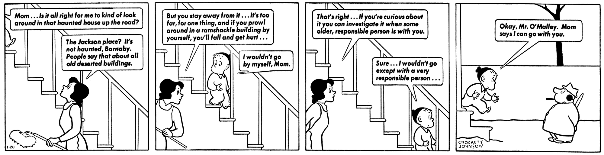
Barnaby strip from January 20th, 1943.
Courtesy of Fantagraphics BooksThe speech bubbles mostly overlap the tops of these planes. Were the type roman, the text would echo the rectilinearity of the interior setting. But at a slight rightward tilt, the words are not only set off from the panels’ line work but, together with Barnaby’s progression down the stairs, aid in propelling the action forward, from one panel to the next. (The eloquent simplicity of Johnson’s lines alongside the typeset dialogue reminds me of Winnie-the-Pooh’s fondness for his ruler, which, he observes, makes “ruling lines for the words to walk on.” Pooh’s sense that a constraint can set language in motion is at work in Barnaby, too.)
In 1946, Ad Reinhardt started making his “How to Look” comics—satirical introductions to modern art and culture that he published in P.M., the Left-leaning newspaper where Barnaby was born. Reinhardt had been Johnson’s compatriot at the American Marxist political and cultural magazine New Masses in the late 1930s (as art editor, Johnson hired Reinhardt to compose spot drawings and cartoons), and in 1944 Reinhardt had collaborated with the writer Ruth Krauss, Johnson’s wife, on the children’s book A Good Man and His Good Wife, which is also set in Futura Medium Oblique.
In the comic “How to Look at Low (Surrealist) Art,” Reinhardt writes that “a painting is not a simple something or a pretty picture or arrangement, but a complicated language you have to learn to read.” He illustrates this idea with a two-part drawing. In the first part, a cartoonishly drawn man points dismissively at an abstract composition of lines and circles and laughs, “Ha ha what does this represent?” In the second part, the painting, which has grown appendages and a face, points at him and demands, “What do you represent?” Encapsulated in this confrontation between geometric abstraction and figuration is a mutual demand for meaning, the carving out of common ground. I see in it a version of Renner’s blend of technology and art and the ineffable aesthetic “rightness” that Johnson felt in his mathematical paintings. In each of these instances—Reinhardt, Renner, and Johnson— space is created by merging two seemingly opposing notions, and this is precisely what Barnaby is about: the meeting place of rationalism and the fantastical.
In his preface to the second volume of the collected Barnaby, the cartoonist Jules Feiffer describes the Baxters as being “as middle-class as Ozzie and Harriet or any of the well-meaning families one found in The Saturday Evening Post or other magazines of the home-front era during World War II.” They represent what, at the time, were considered enduring American ideals and values. “And into this vision of everlasting normality,” Feiffer writes, “entered Barnaby and his Fairy Godfather, Mr. O’Malley.” This push and pull is in Heer’s argument that “the fantastic elements in Barnaby are grounded by the countless small touches of [modern suburban] verisimilitude that pepper the strip, which serve to make the fairytale elements of the stories more piquant.” The typesetting is one of those touches of verisimilitude: a modern type that carries the same quality of virtuous sophistication and measured good taste elicited in contemporary domestic design, but set—significantly—at a slant. The oblique font signals the warning Feiffer sees in Mr. O’Malley: middle-class values beginning to take a tumble, on their way to being upended by political and cultural changes. The font becomes a sign of life on the verge.

Barnaby strip from May 1st, 1944.
Courtesy of Fantagraphics BooksSet askew, the text signals the middle ground between Mr. Baxter, the authoritative paterfamilias who resembles the uprightness of a roman font, and Mr. O’Malley, the befuddled imaginary creature who might be described by a florid cursive. The critic Bruno Lecigne defined Hergé’s aesthetic by, among other qualities, its “semi-realism”; the same betwixt-and-between quality characterizes both the narrative of Barnaby and its typography. This arrangement gives Johnson the ability, as Cézanne put it, to do what he wants. The Belgian writer Pierre Sterckx called ligne claire “a logical typography of the visible.” Johnson uses ligne claire to make the invisible visible, to give form to the imaginary. (We’re not so far now from Harold and his crayon or Johnson’s mathematical-theorem paintings.) In the strip from May 1st, 1944, O’Malley tells Barnaby, “The only way to convince your parents that I exist, m’boy, is to go to them with a scholarly, authoritative, anthropological and sociological treatise on Pixies in general . . . But such a work has never been written!” Mr. O’Malley’s proposal, to marshal the forces of logic to prove the existence of the imaginary, is absurd—and also quite rational. Writing in P.M. in 1943, the journalist Max Lerner observed that Johnson “gets a fresh perspective by assigning the conventional qualities to unconventional characters.” Lerner called this exchange “a trans-valuation of values.” In the strip from January 28th, 1943, Mr. O’Malley takes Barnaby and his friend Jane on a night excursion through the woods to a haunted house. Spooked by the possibility of a mystical encounter, O’Malley changes his mind. “Hurry up, children,” he tells Barnaby and Jane. “Let’s get away from this place before we begin to indulge in speculation . . . Can’t have your imaginations running wild.”

Barnaby strip from January 28th, 1943.
Courtesy of Fantagraphics BooksIn his study of Renner, Christopher Burke reports that the typographer read widely in philosophy and literature, and he links this interest in “crafting the sense of words” with Renner’s concern for their visual form. Is it a stretch to imagine that Johnson felt a similar inclination—as a graphic designer, artist, and writer—to encourage a spiritual as well as formal bond between the type and drawings in Barnaby? Language gives each strip its color and shading, its detail and action: its reality, both physical and metaphysical. But language in Barnaby, and in comics more generally, isn’t limited to the words Johnson chooses. Atlas the Mental Giant uses mathematical formulas as mnemonic devices for words. (“A Mental Giant never burdens his mind with a lot of easily obtainable data,” O’Malley explains.) Asked whether he pulled up the beanstalk in Barnaby’s garden, Atlas consults his slide rule. After a complex series of calculations, he lands on the answer: “No . . . I didn’t do it.” Mathematical formulas may be word pictures par excellence—a language in which the form of writing is inseparable from its content. Atlas shows us, as Morris guessed in his experiment, that the literal shape of words affects not just how we perceive meaning but how we perceive the world. ♦
All images are copyright © 2025 The Estate of Ruth Krauss.
Subscribe to Broadcast